You can find all the usable Main Modules listed below with detailed features and specifications.
This Document makes no claim to completeness or validity.
Last updated:
| Field | Specification | Info | Required |
|---|---|---|---|
| Product | - | - | yes |
| Headline | Max. 130 characters | For SEO Purposes it is recommended to use a long tail keyword within the heading. | yes |
| Benefit | - | - | yes |
| Eyecatcher Text | max. 40 characters | - | no |
| Link text | - | - | yes |
| Internal Link | - | - | yes |
| Field | Specification | Info | Required |
|---|---|---|---|
| Position | - | Just add the module at the desired position of the page | yes |
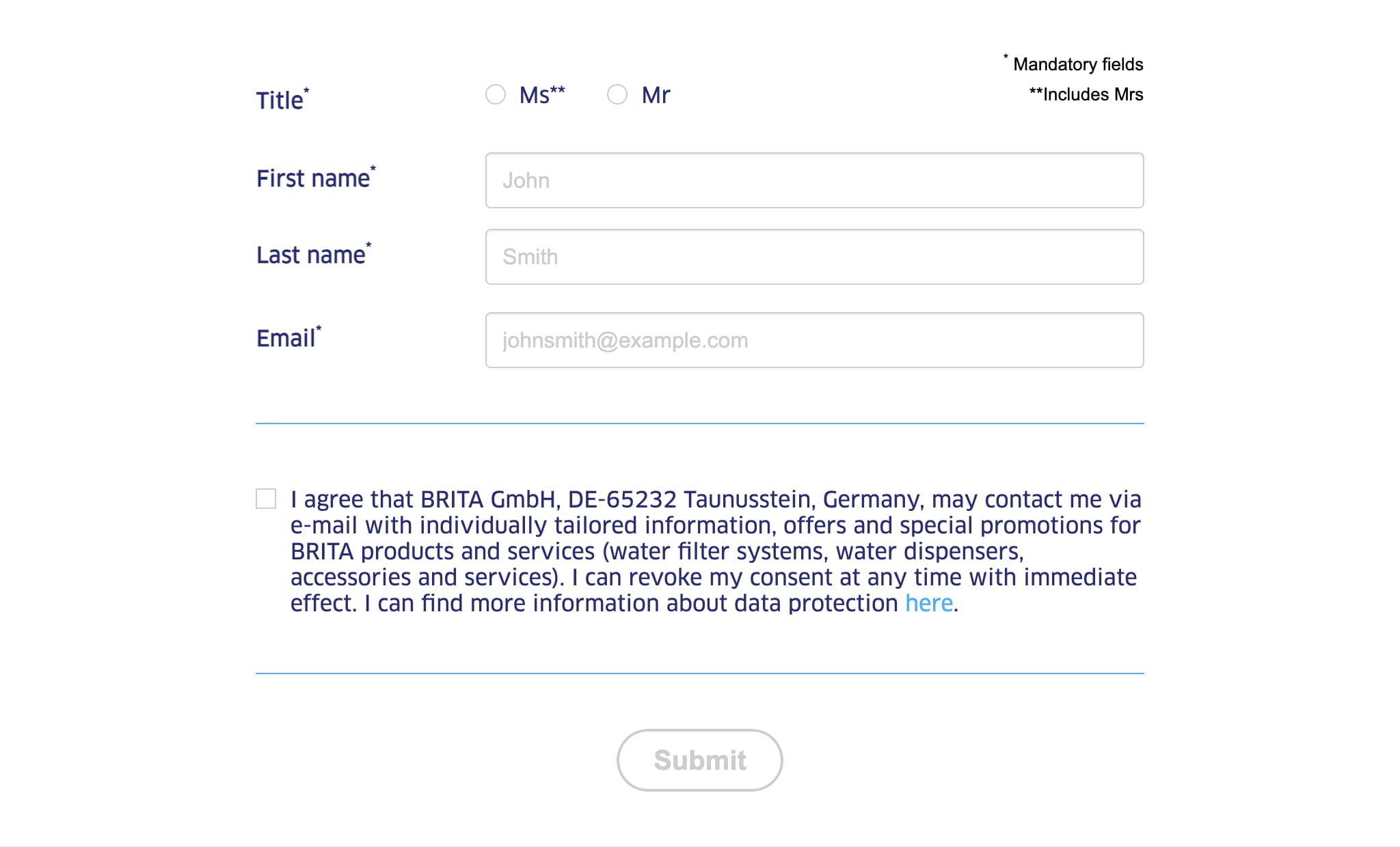
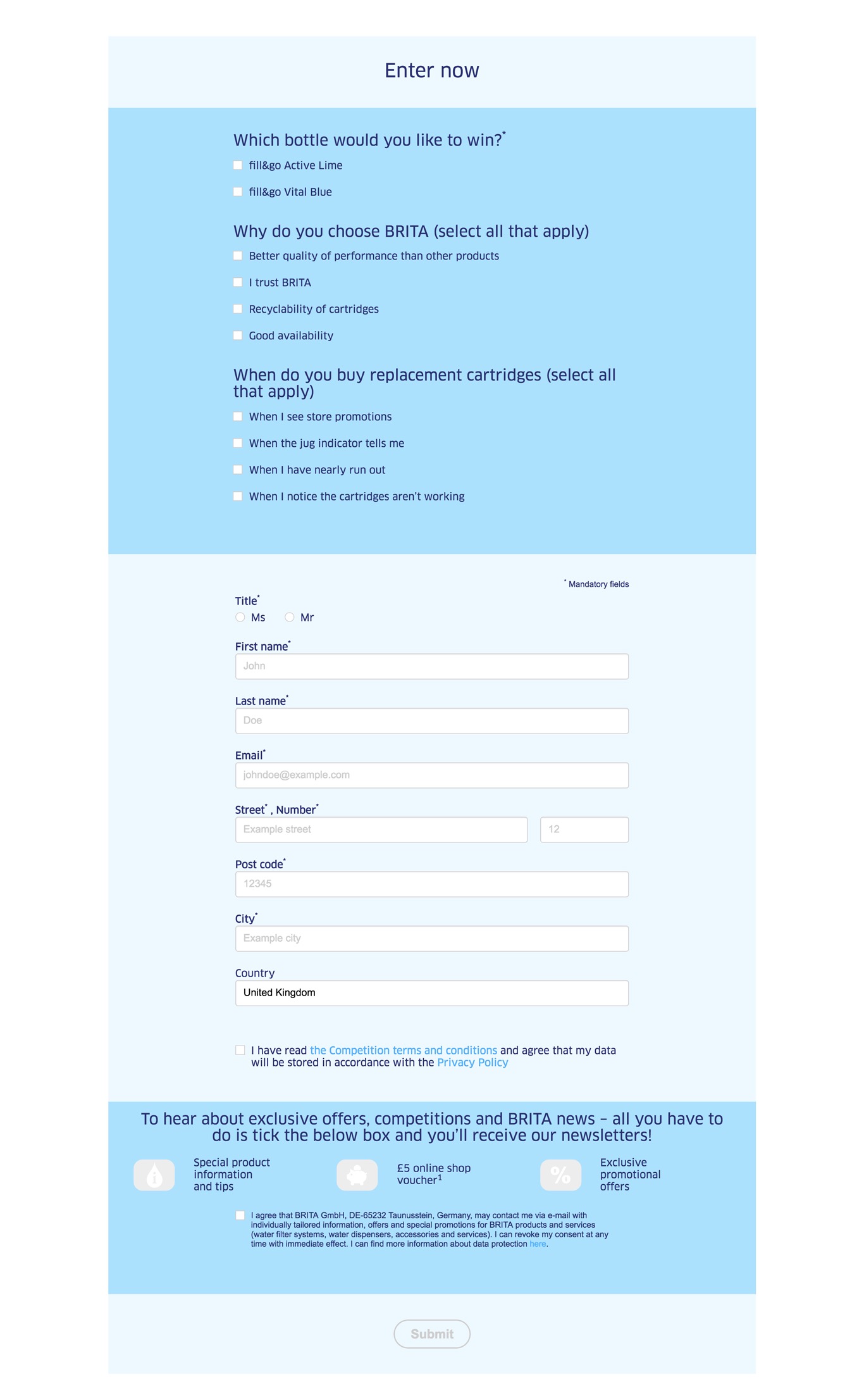
"First name" and "Surname" are per default mandatory fields and thus are not shown in the settings anymore.
Uncheck In-Built Anchor if you want to create a custom anchor for example to use with the Content Navigation Component.
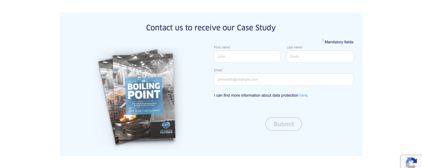
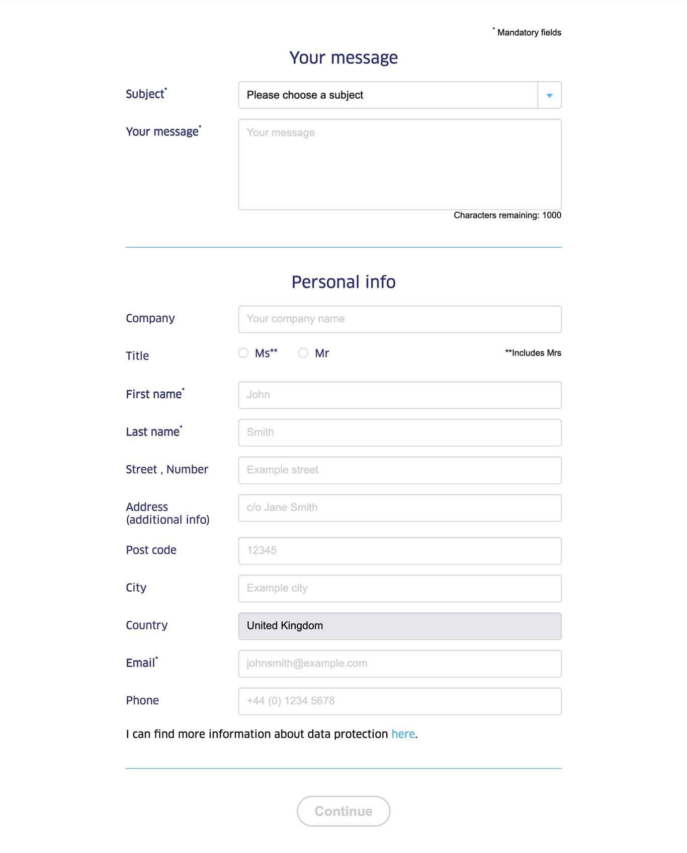
| Field | Specification | Info | Required |
|---|---|---|---|
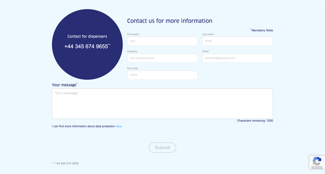
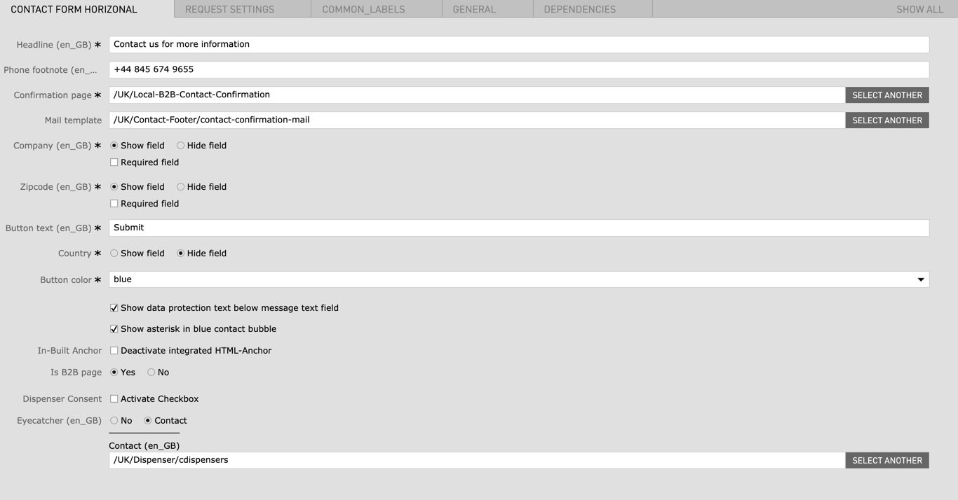
| Contact Form Horizontal | |||
| Headline | Max. 60 characters | - | yes |
| Phone footnote | max. 130 characters | - | no |
| Confirmation page | - | A confirmation page has to be created or an existing confirmation page can be linked here | yes |
| Mail template | - | A confirmation mail template can be chosen here | no |
| Company |
|
yes | |
| Zipcode |
|
yes | |
| Button text | max. 25 characters | - | yes |
| Country | - | yes | |
| Button color |
|
- | yes |
| Show data protection text below message text field | - | - | no |
| Show asterisk in blue contact bubble | - | - | no |
| In-Built Anchor | Deactivate integrated HTML-Anchor | This option removes the default contact form anchor so you can create your own custom anchor | no |
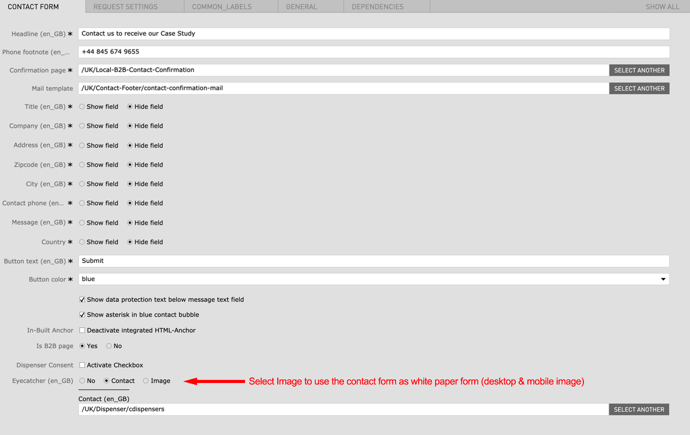
| Is B2B Page |
|
- | no |
| Dispenser Consent | Activate Checkbox | - | no |
| Eyecatcher |
|
|
no |
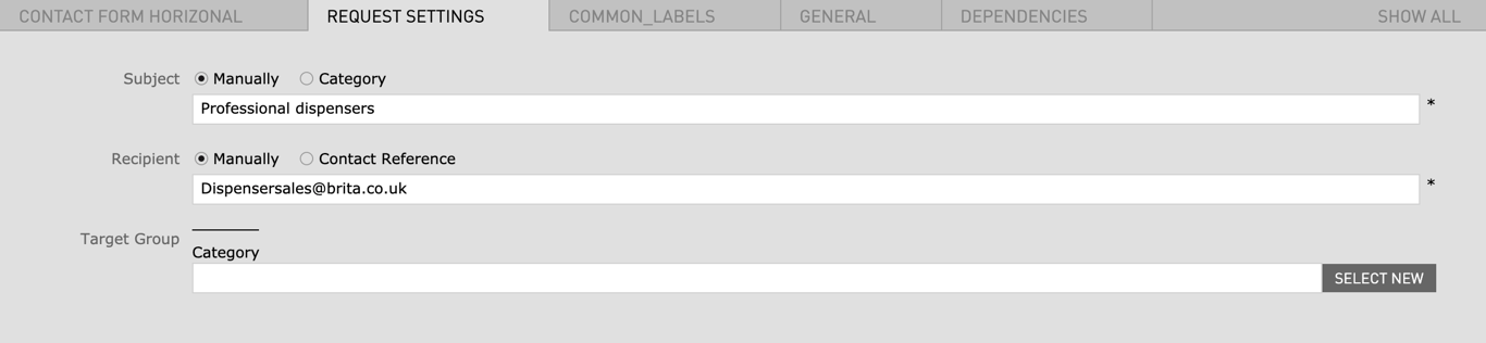
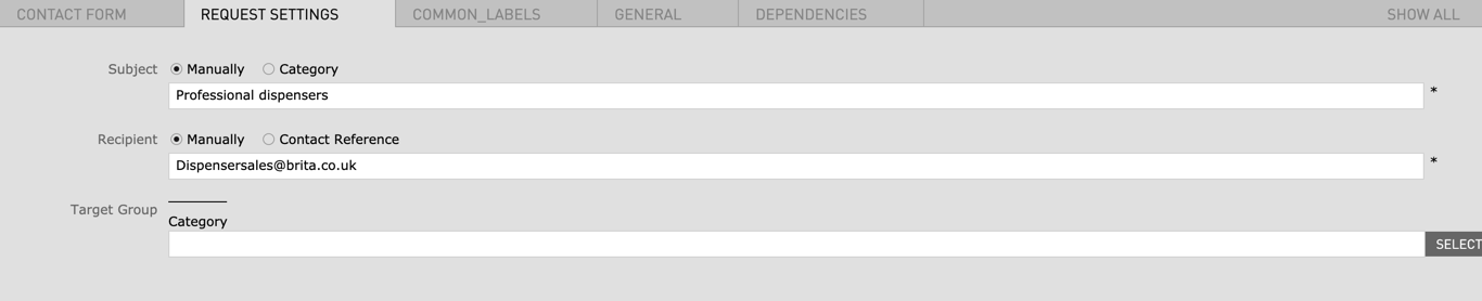
| Request Settings | |||
| Subject |
|
- | no |
| Recipient |
|
- | no |
"First name" and "Surname" are per default mandatory fields and thus are not shown in the settings anymore.
| Field | Specification | Info | Required |
|---|---|---|---|
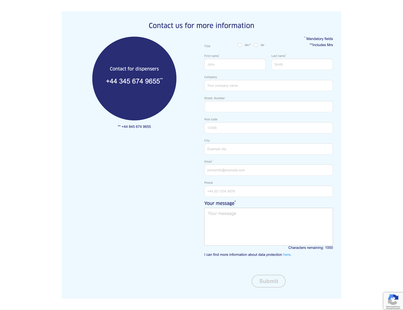
| Contact Form Horizontal | |||
| Headline | Max. 60 characters | - | yes |
| Phone footnote | max. 130 characters | - | no |
| Confirmation page | - | A confirmation page has to be created or an existing confirmation page can be linked here | yes |
| Mail template | - | A confirmation mail template can be chosen here | no |
| Title |
|
yes | |
| Company |
|
yes | |
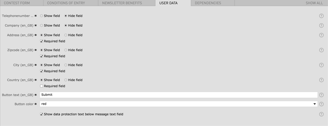
| Address |
|
yes | |
| Zipcode |
|
yes | |
| City |
|
yes | |
| Contact phone |
|
yes | |
| Message |
|
yes | |
| Country | - | yes | |
| Button text | max. 25 characters | - | yes |
| Button color |
|
- | yes |
| Show data protection text below message text field | - | - | no |
| Show asterisk in blue contact bubble | - | - | no |
| In-Built Anchor | Deactivate integrated HTML-Anchor | This option removes the default contact form anchor so you can create your own custom anchor | no |
| Is B2B Page |
|
- | no |
| Dispenser Consent | Activate Checkbox | - | no |
| Eyecatcher |
|
|
no |
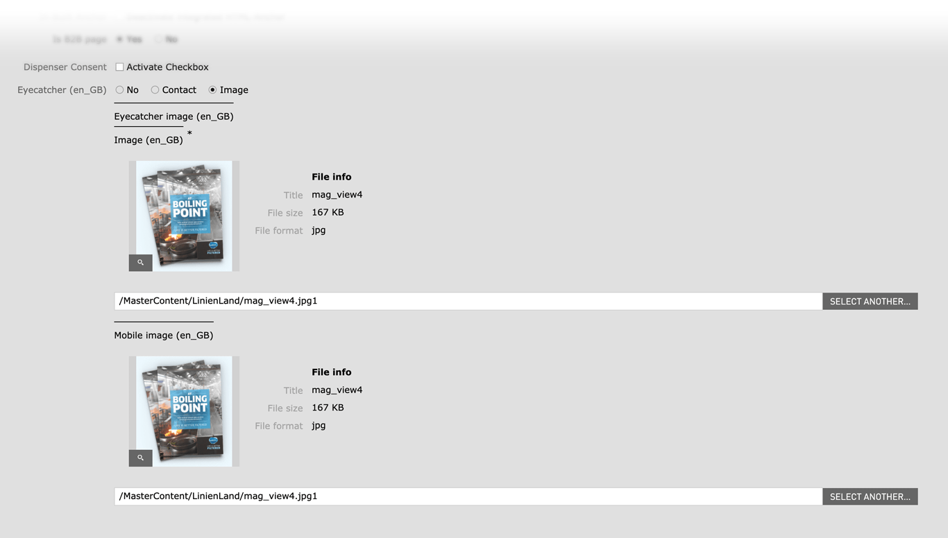
| Image Desktop | 464 x Flexible / Fileformat JPG, PNG | - | yes |
| Image Mobile | 710 x Flexible / Fileformat JPG, PNG | - | yes |
| Request Settings | |||
| Subject |
|
- | no |
| Recipient |
|
- | no |
| Field | Specification | Info | Required |
|---|---|---|---|
| Headline - Subheadline | |||
| Headline | max. 60 characters | - | yes |
| Subheadline | max. 130 characters | - | no |
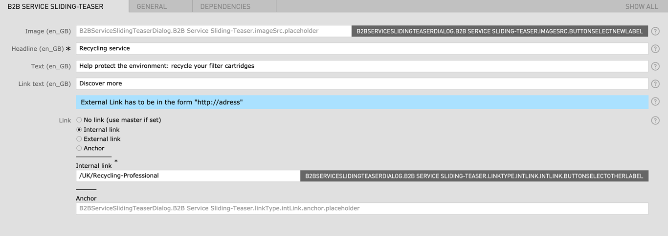
| B2B Service Sliding Teaser | |||
| Image | Fileformat JPG / PNG | - | yes |
| Headline | max. 60 characters | - | yes |
| Text | max. 130 characters | - | no |
| Link Text | max. 60 characters | - | no |
| Link |
|
- | no |
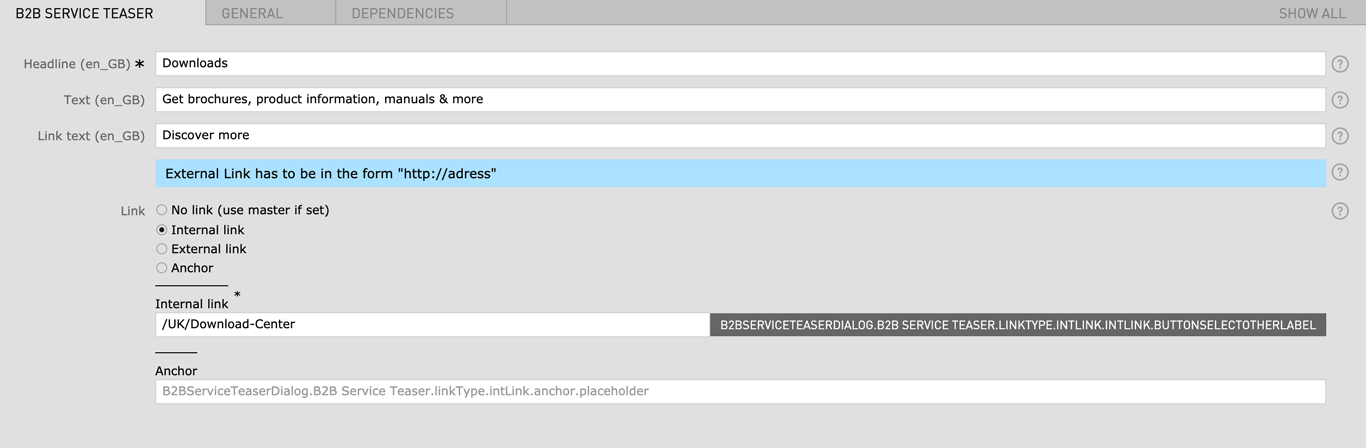
| B2B Service Teaser | |||
| Headline | max. 60 characters | - | yes |
| Text | max. 130 characters | - | no |
| Link Text | max. 60 characters | - | no |
| Link |
|
- | no |
| Field | Specification | Info | Required |
|---|---|---|---|
| Headline | max. 130 characters | For SEO Purposes it is recommended to use a long tail keyword within the heading. | |
| Subheadline | - | - | no |
| Benefit | - | has to be created before in the Benefits App (not accessible to all CMS editors) | yes |
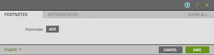
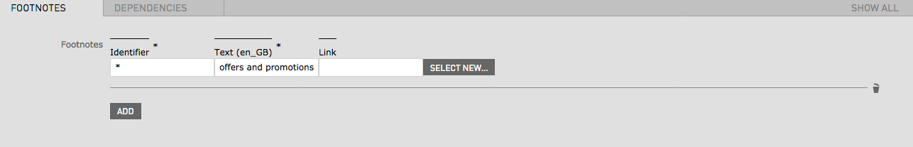
| Text (Footnote) | - | - | no |
| Identifier | - | A symbol or number can be used (for example: * or 2) | no |
| Field | Specification | Info | Required |
|---|---|---|---|
| Headline | max. 130 characters | For SEO Purposes it is recommended to use a long tail keyword within the heading. | yes |
| Benefit | - | has to be created before in Benefit Asset Folder | yes |
| Field | Specification | Info | Required |
|---|---|---|---|
| Button text | max. 130 characters | - | yes |
| Linktype |
|
- | yes |
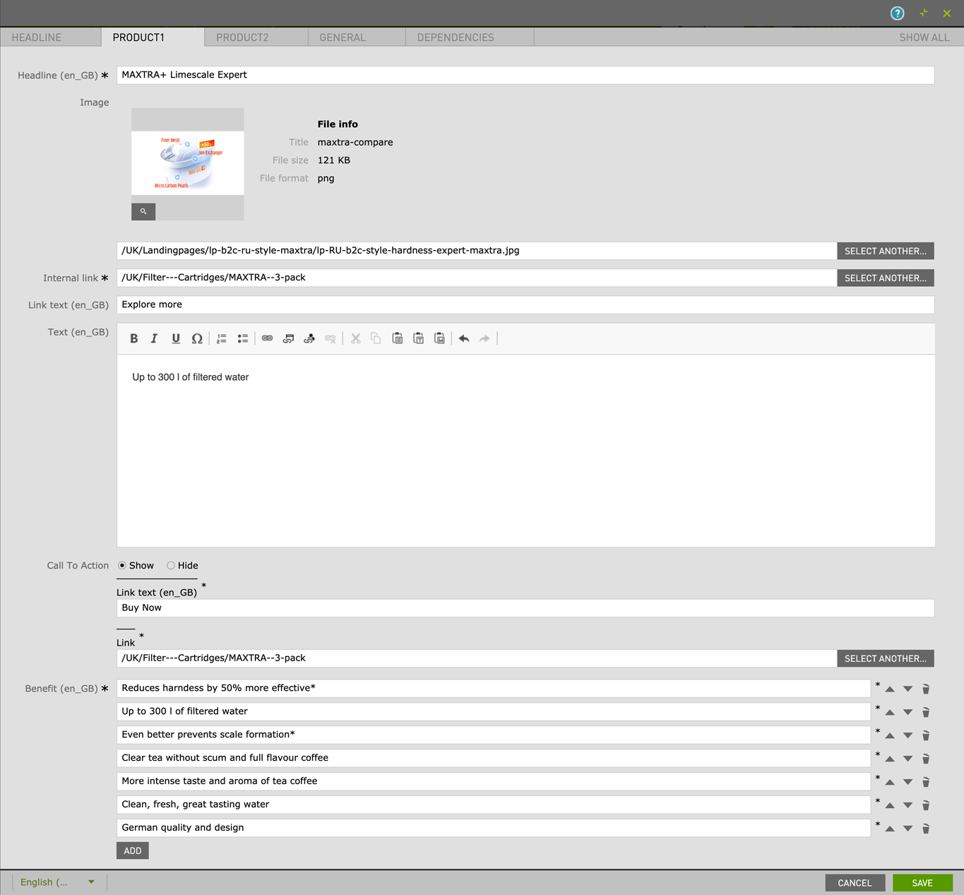
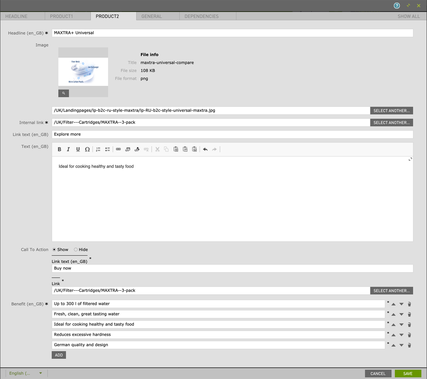
| Field | Specification | Info | Required |
|---|---|---|---|
| Headline | max. 130 characters | - | yes |
| Product 1 & 2 | |||
| Headline | max. 130 characters | - | yes |
| Image | 724px × 406px | - | no |
| Internal link | - | - | no |
| Link Text | max. 30 characters | - | no |
| Text | - | - | no |
| Call To Action | Show / Hide | - | no |
| Benefit (bullet list) | max. 130 characters | - | yes |
| Field | Specification | Info | Required |
|---|---|---|---|
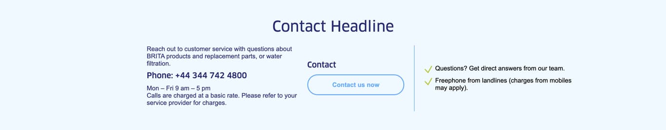
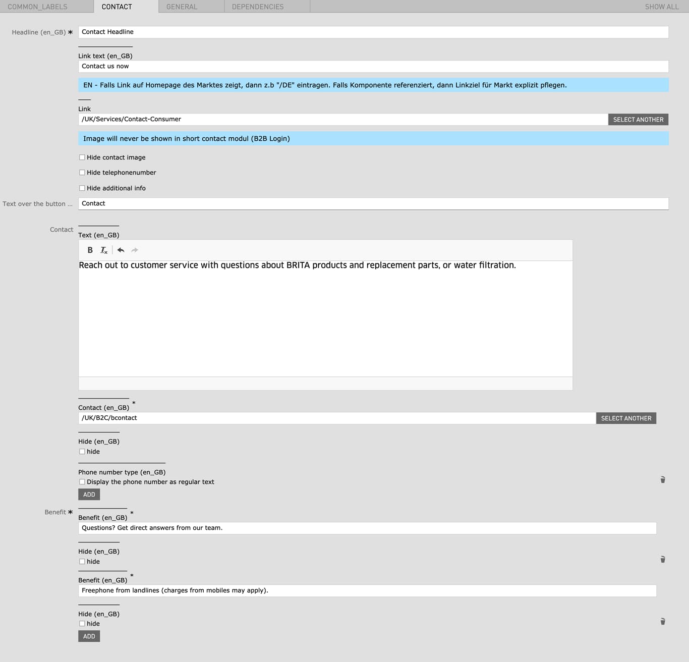
| Headline | Max. 130 characters | - | yes |
| Link text | max. 60 characters | - | no |
| Link | - | You can specify a link to a contact form here | no |
| Hide contact image | - | - | no |
| Hide telephonenumber | - | - | no |
| Hide additional info | - | - | no |
| Text over the button | - | - | no |
| Contact | - | When a Contact is selected a Contact number is displayed on the left side | no |
| Hide | - | - | no |
| Phone number type | - | Display the phone number as regular text | no |
| Benefit (bullet list) | - | Add a custom bullet list which will be displayed on the right side | yes |
| Hide | - | - | no |
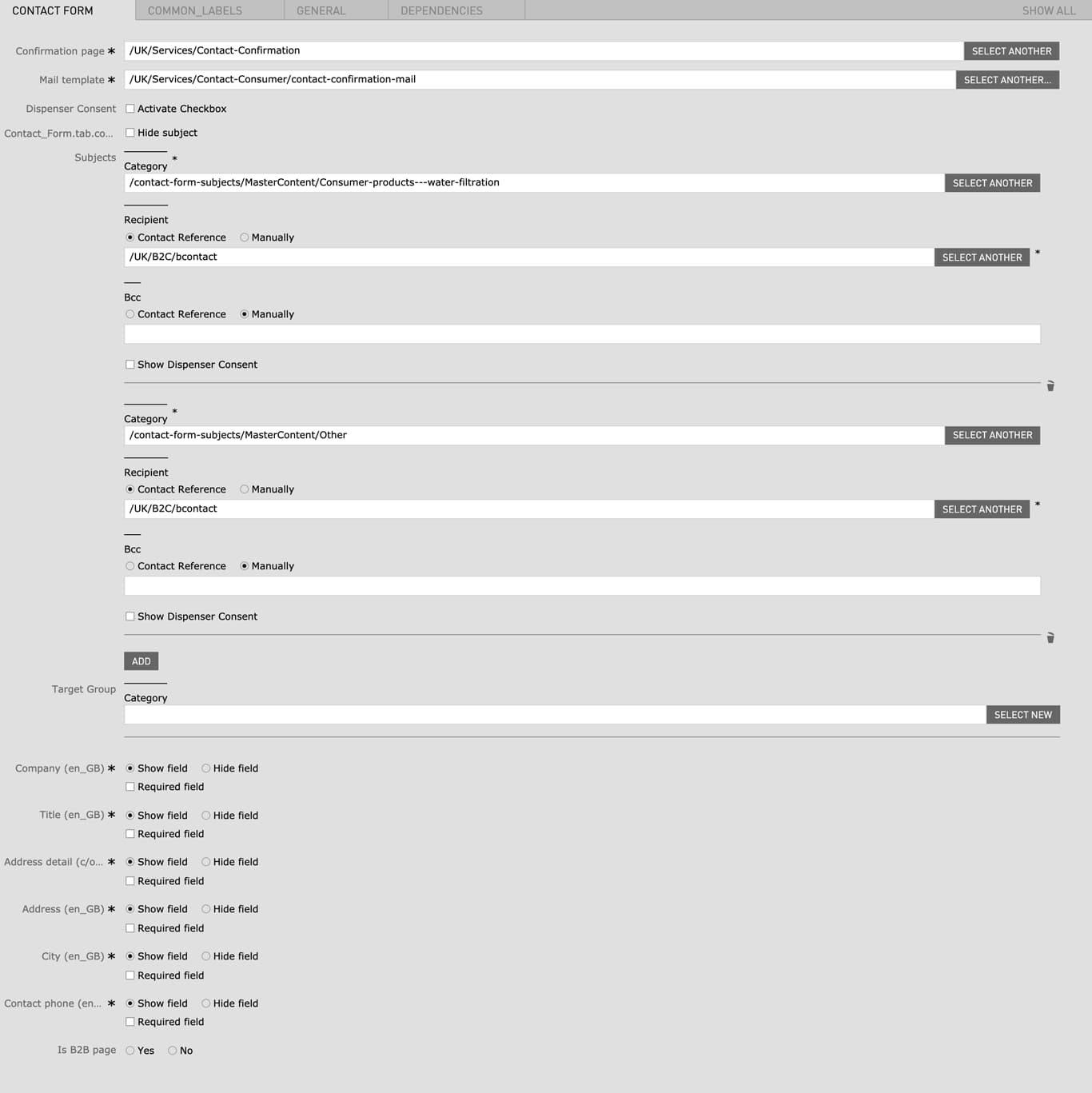
| Field | Specification | Info | Required |
|---|---|---|---|
| Confirmation page | - | A confirmation page has to be created or an existing confirmation page can be linked here | yes |
| Mail template | - | A confirmation mail template can be chosen here | no |
| Dispenser Consent |
|
- | no |
| Subject |
|
- | no |
| Recipient |
|
- | no |
| BCC |
|
- | no |
| Target Group |
|
- | no |
| Company |
|
- | yes |
| Title |
|
- | yes |
| Address detail |
|
- | yes |
| Address |
|
- | yes |
| City |
|
- | yes |
| Contact phone |
|
- | yes |
| Is Image Page |
|
- | no |
Open Live Example Open Live Example (Via VPN)
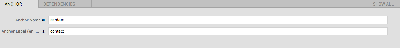
| Field | Specification | Info | Required |
|---|---|---|---|
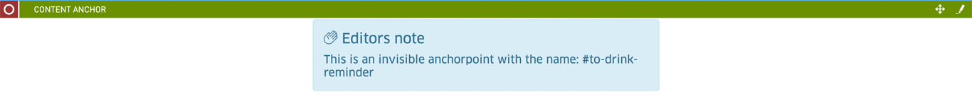
| Anchor name | the anchor name will be the actual anchor used for the anchor link. the resulting anchor consists of the automatically generated prefix "to-" and the anchor name you have specified (example: to-your-anchor). for the anchor name are only lowercase letters and hyphens allowed. | yes | |
| Anchor label | - | The anchor label is only relevant in combination with the content navigation module. The anchor label will be used as the displayed link text for the anchor links in the content navigation module | yes |
All Contact Forms have a default ID with a default anchor label that will be used by the Content Navigation component as the link name. If you want to change the link name that is used for the Content Navigation you can deactivate the built-in anchor in your Contact Form components. After deactivating you can create your own Content Anchor component and name it as desired.
You can find further information in the Contact Form specifications:
Before creating the Content Navigation Content Anchor Modules need to be created on the page
Open Live Example Open Live Example (Via VPN)
| Field | Specification | Info | Required |
|---|---|---|---|
| Content Anchors | Anchors must be created via the Content Anchor Module beforehand | Anchor Label from the Content Anchor will be displayed as Name of the Navigation | yes |
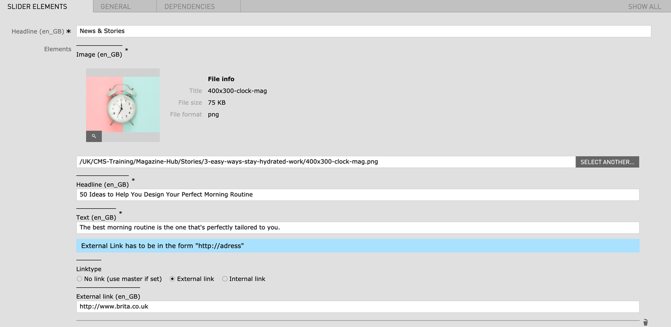
| Field | Specification | Info | Required |
|---|---|---|---|
| Headline | Max. 130 characters | - | yes |
| Image |
|
- | yes |
| Slides | |||
| Headline | Max. 130 characters | - | yes |
| Text | Max. 130 characters | - | yes |
| Linktype |
|
- | no |
If you would like to use this module on your magazine or landing pages please contact Linienland
| Field | Specification | Info | Required |
|---|---|---|---|
| ? | - | - | yes |
| ? | - | - | yes |
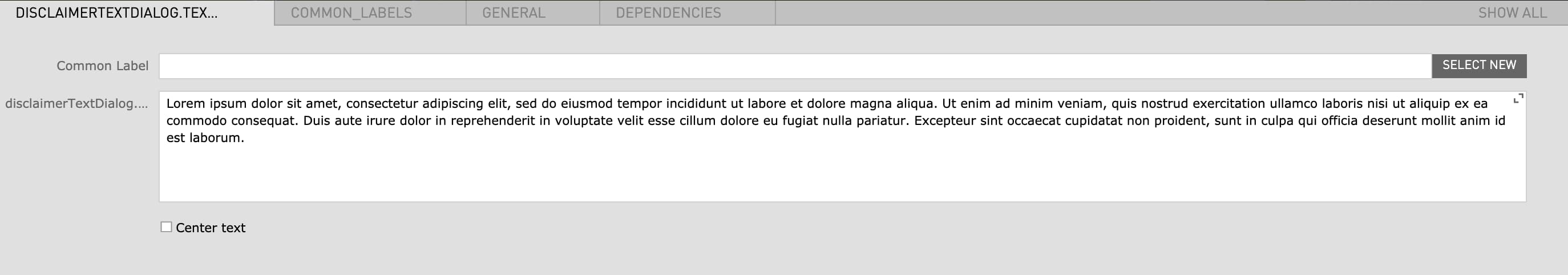
| Field | Specification | Info | Required |
|---|---|---|---|
| Text | - | - | no |
| Center text | checkbox | Centers the text paragraph | no |
| Field | Specification | Info | Required |
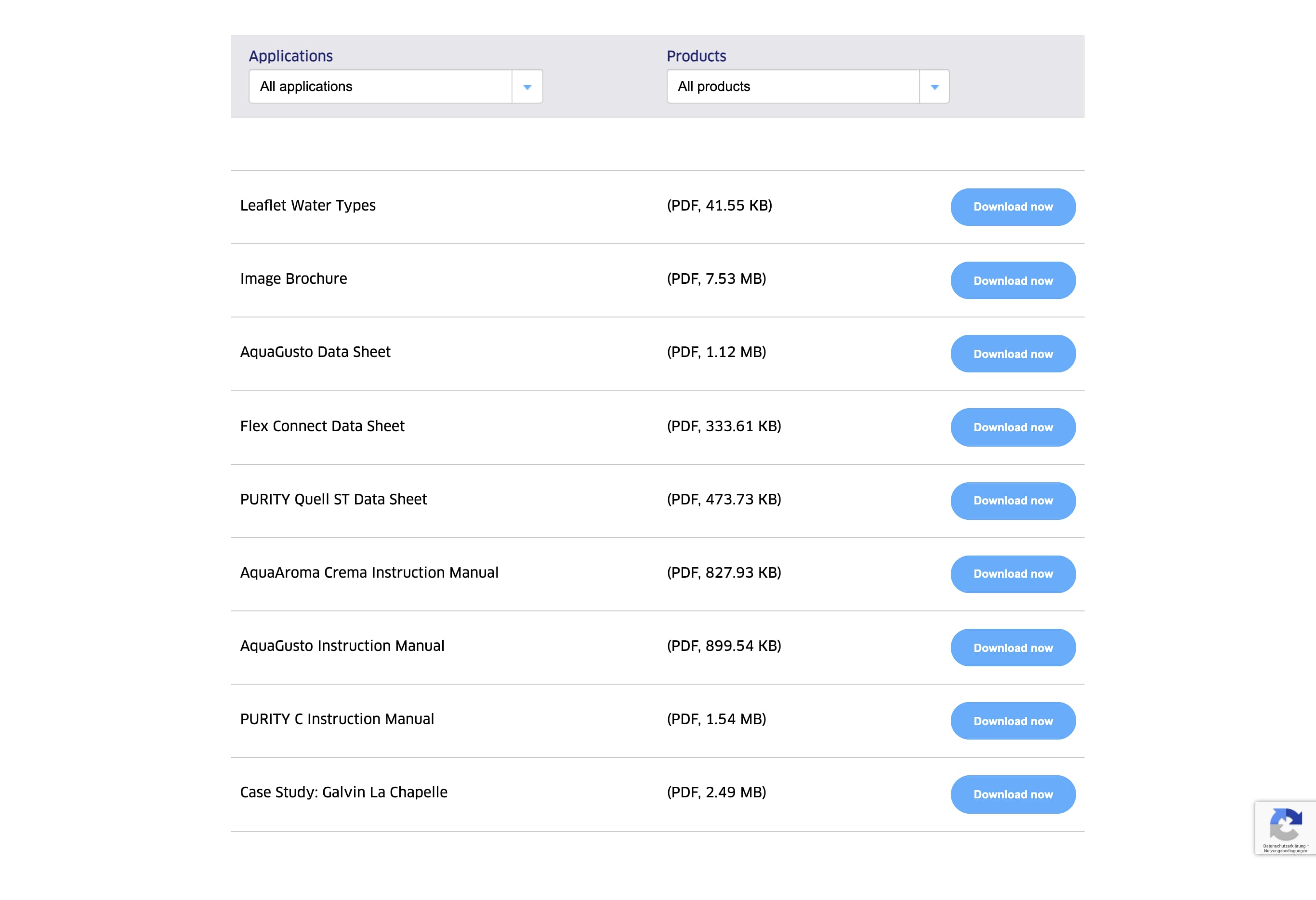
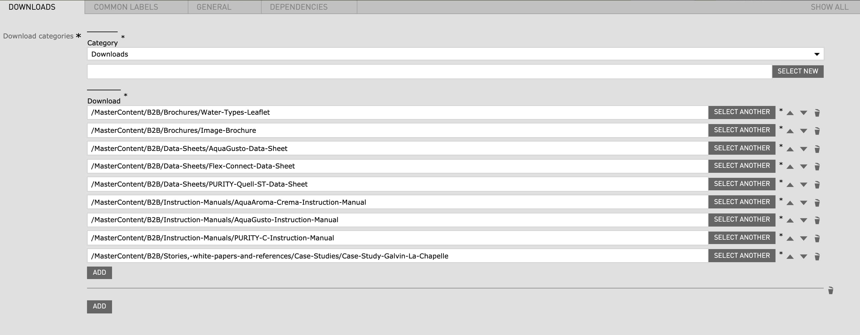
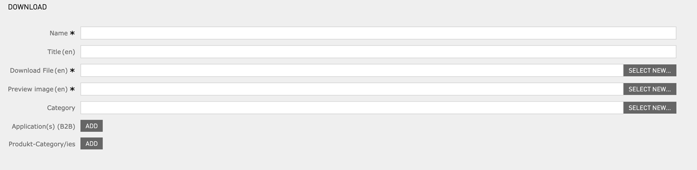
|---|---|---|---|
| Download categories | - | - | yes |
| Download | - | has to be created before in the "Download" app | yes |
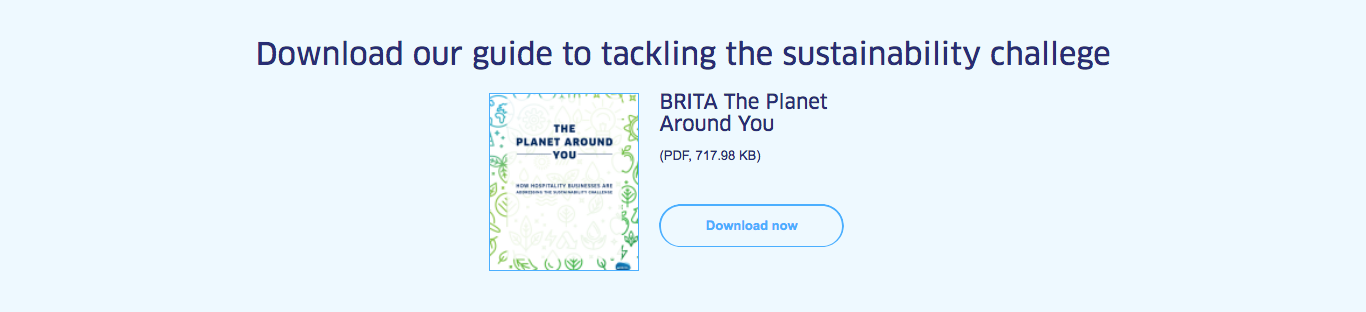
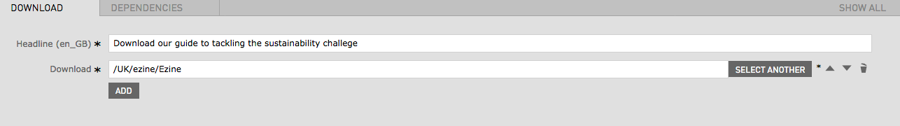
| Field | Specification | Info | Required |
|---|---|---|---|
| Headline | max. 130 characters | - | yes |
| Download | - | has to be created before in the "Download" app | yes |
| Image |
|
- | yes |
| Field | Specification | Info | Required |
|---|---|---|---|
| Headline | max. 130 characters | - | yes |
| Download | - | has to be created before in the "Download" app | yes |
| Link text | - | - | no |
| Link | Internal Link | - | no |
If you would like to use this module on your magazine or landing pages please contact BRITA Website Team or Linienland
| Field | Specification | Info | Required |
|---|---|---|---|
| Product type |
|
The product explosion graphics are preconfigured in the Master Content and can't be changed by editors. | yes |
| Headline | - | - | yes |
| Text | - | - | yes |
| Field | Specification | Info | Required |
|---|---|---|---|
| Identifier | - | yes | |
| Text | max. 130 characters | - | yes |
| Link | Internal Link | - | no |
| Field | Specification | Info | Required |
|---|---|---|---|
| Text | - | - | yes |
| No top margin | checkbox | Removes the top margin of the module | no |
| Field | Specification | Info | Required |
|---|---|---|---|
| Text (Headline) | max. 130 characters | For SEO Purposes it is recommended to use a long tail keyword within the heading. | yes |
| Style of text | - |
|
no |
| Field | Specification | Info | Required |
|---|---|---|---|
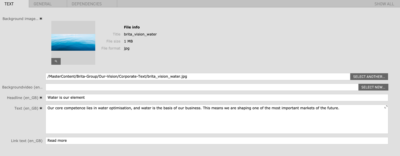
| Background Image |
|
- | yes |
| Background Video |
|
- | no |
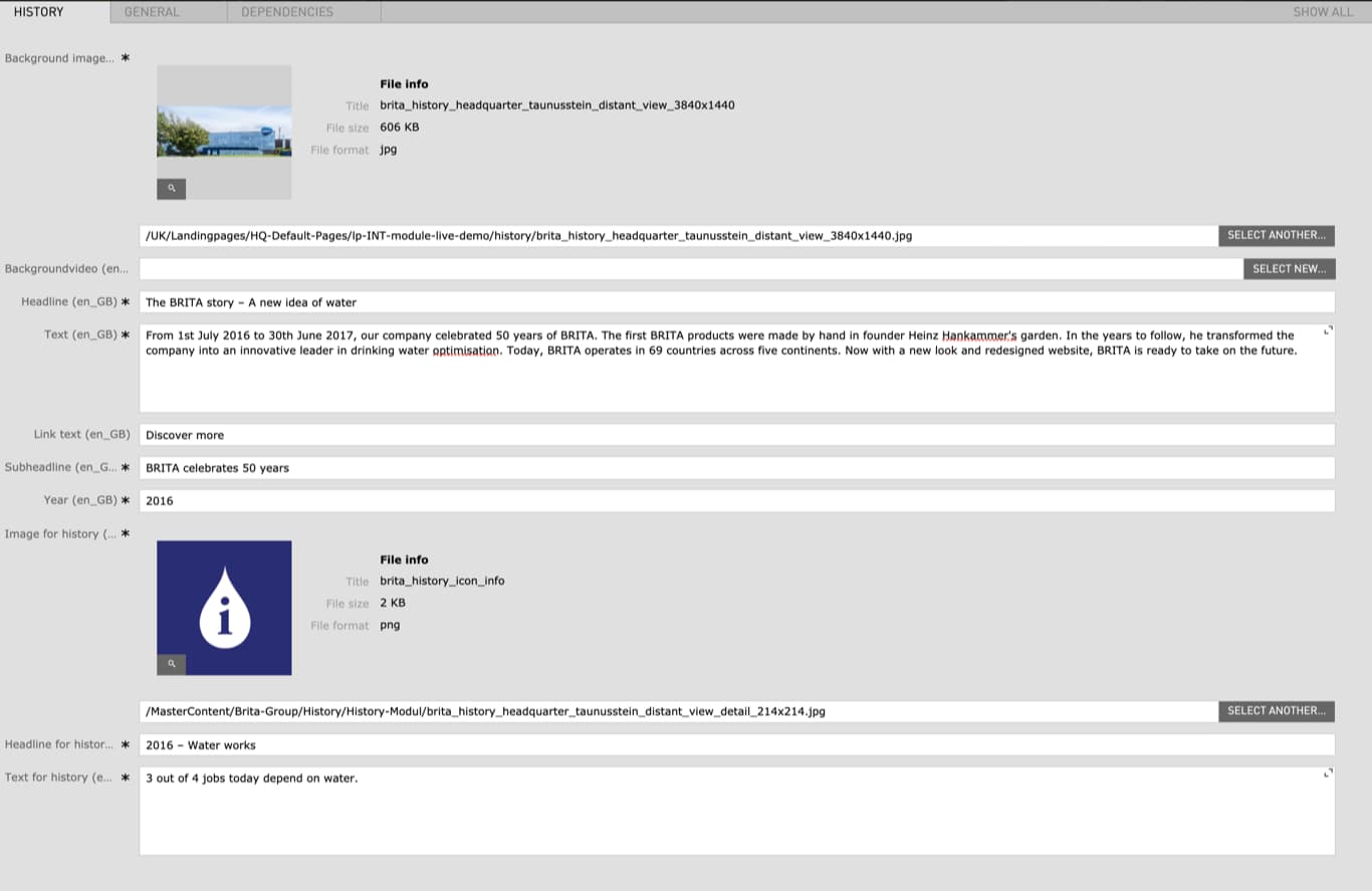
| Headline | max. 130 characters | - | yes |
| Text | - | - | yes |
| Link text | - | - | no |
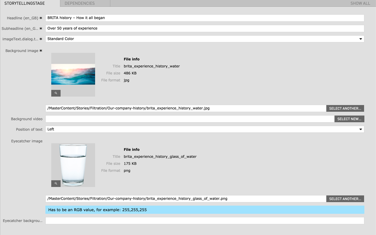
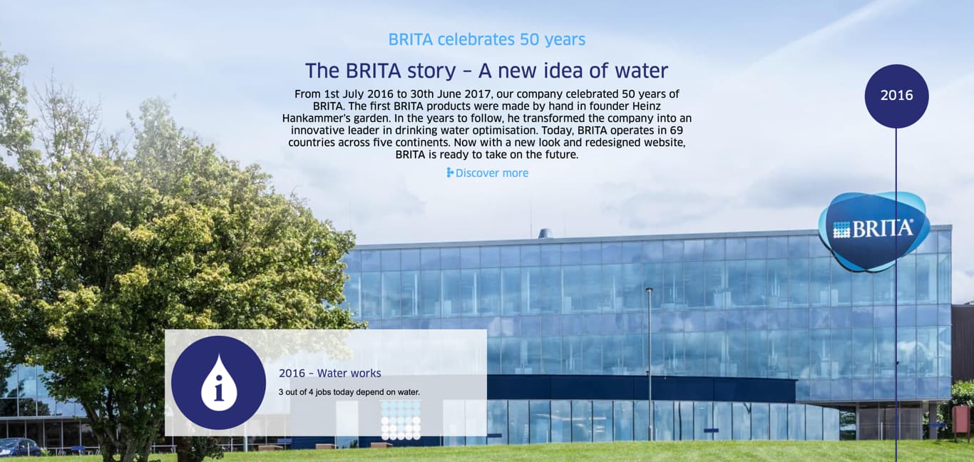
| Subheadline | - | - | yes |
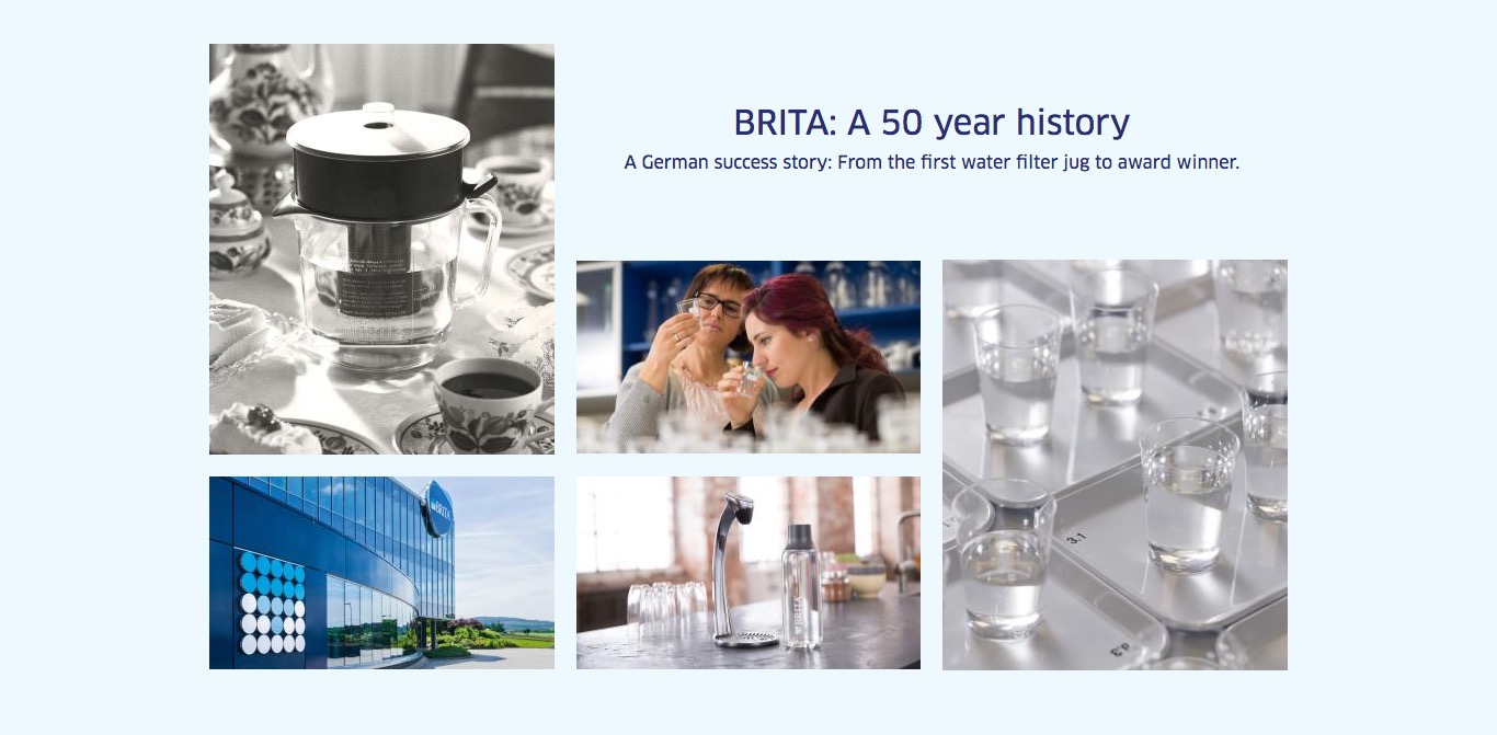
| Year | - | - | yes |
| Image for history |
|
- | yes |
| Headline for history | - | - | yes |
| Text for history | - | - | yes |
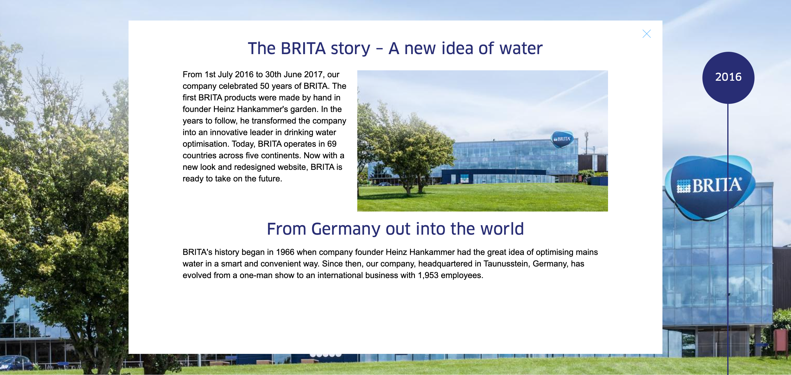
| The Following Modules can be inserted in the lightbox | |||
| Highlight Text | More Information | ||
| Image Rich Text | More Information | ||
| Rich Text | More Information | ||
| Field | Specification | Info | Required |
|---|---|---|---|
| Background | |||
| Background image | 1500px x 720px / Fileformat JPG/PNG | - | yes |
| Background video | 1500px x 720px / Fileformat MP4 | - | no |
| Headline | Max. 130 characters | For SEO Purposes it is recommended to use a long tail keyword within the heading. | yes |
|
|
max. 300 characters | - | yes |
| Link text | max. 60 characters | - | no |
| Lightbox Headline | |||
|
|
max. 130 characters | - | yes |
|
|
|
- | no |
| Lightbox Content | |||
|
|
max. 300 characters | - | yes |
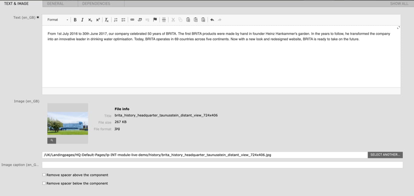
| Image | 724px x 406px / Fileformat JPG/PNG | - | no |
| Image caption | max. 60 characters | - | no |
| Field | Specification | Info | Required |
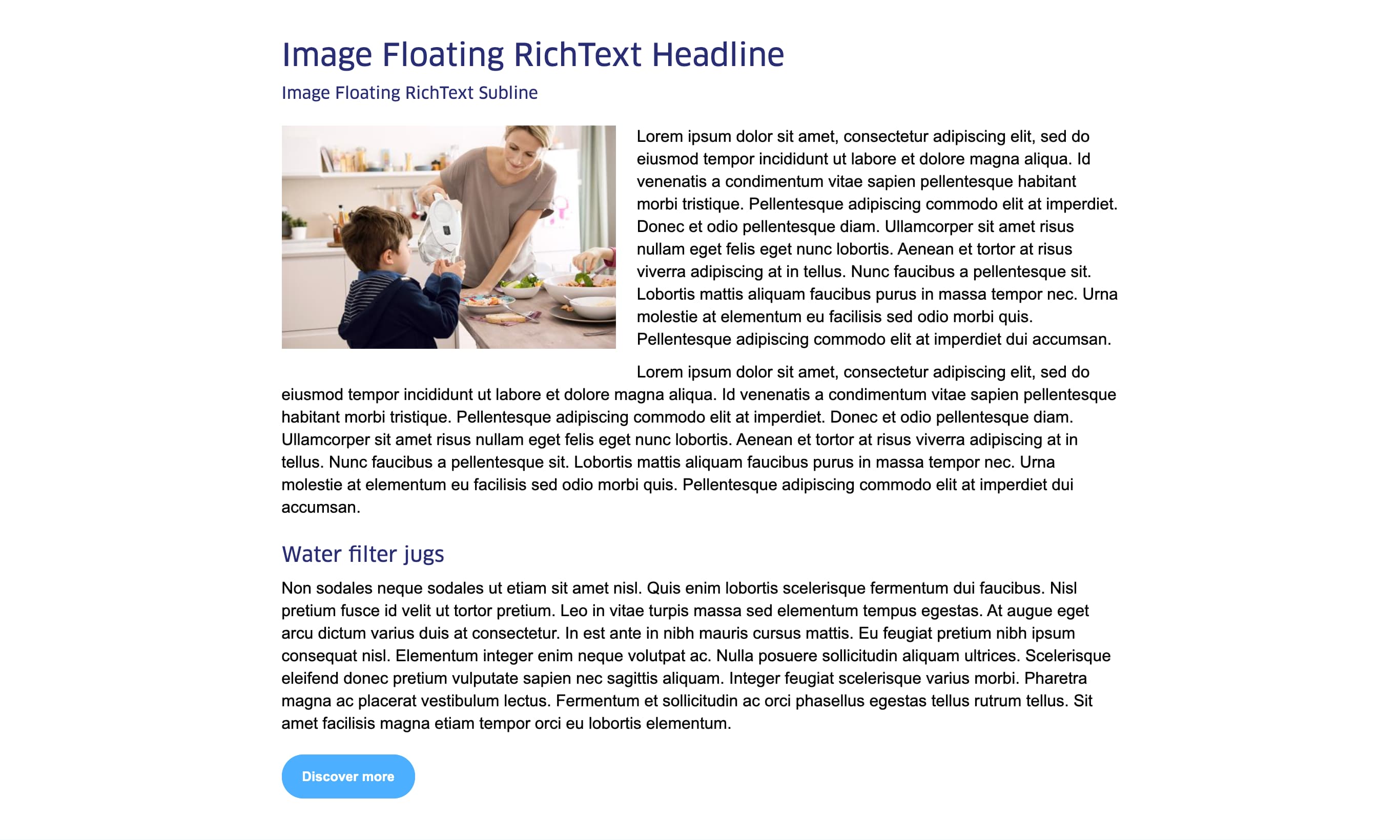
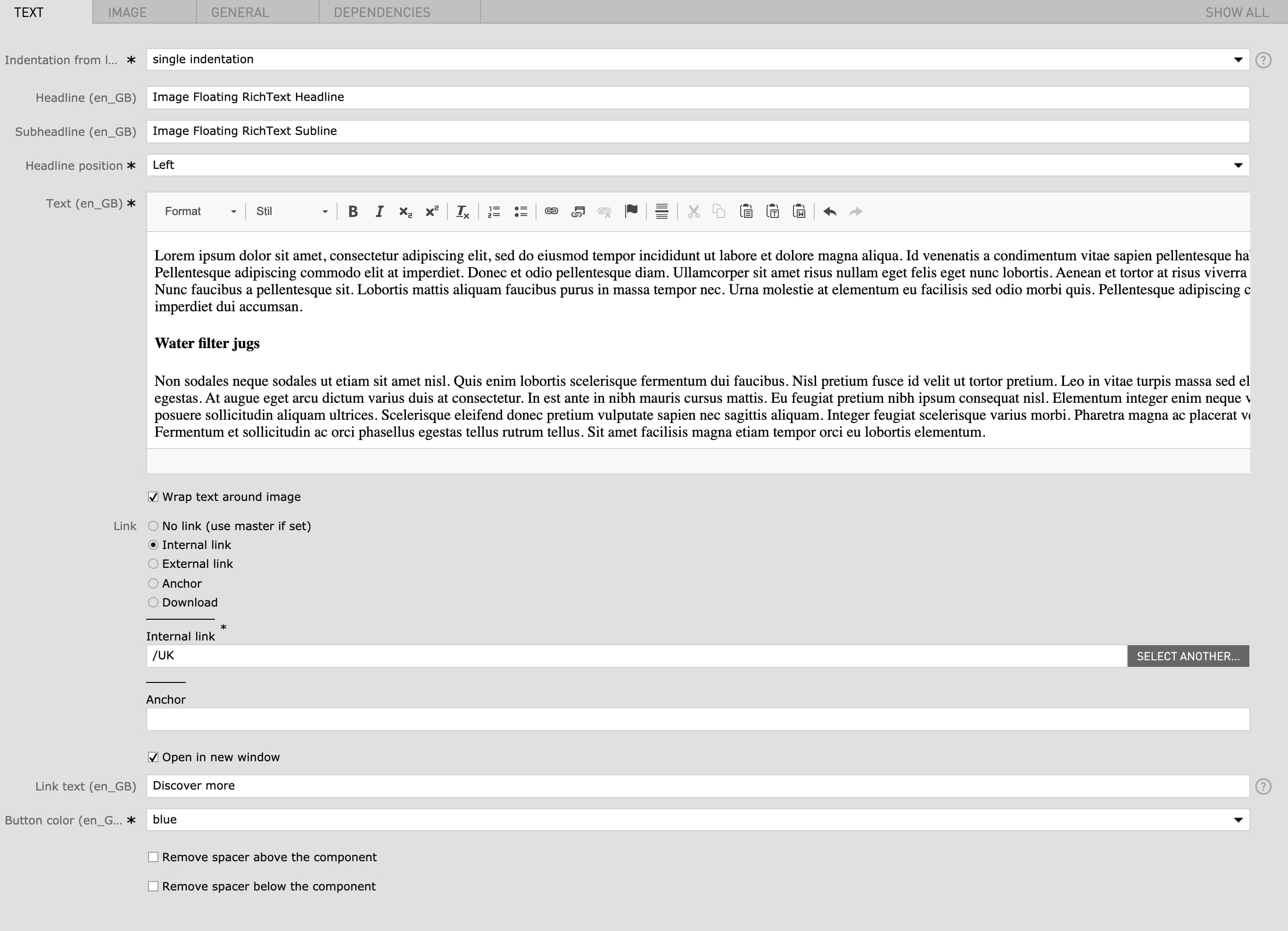
|---|---|---|---|
| Text Settings | |||
| Indentation from left |
|
You can indent the whole module in order to have a better fit with other module below or above. | yes |
| Headline | max. 120 characters |
|
no |
| Subheadline | - | - | no |
| Headline position |
|
- | yes |
| Text | - |
|
yes |
| Wrap text around image | - | if checked the text paragraph will be wrapped around the image | no |
| Link |
|
- | no |
| Open in new window | - | open link in new window | no |
| Link text | max. 80 characters | - | no |
| Button color |
|
- | yes |
| Remove spacer above the component | checkbox | Removes the top margin of the module | no |
| Remove spacer below the component | checkbox | Removes the bottom margin of the module | no |
| Image Settings | |||
| Image (Width) |
|
For best quality, the given minimum width are recommended for the images. The image height is flexible. | no |
| Mobile Image (Width) |
|
For best quality, the given minimum width are recommended for the images. The image height is flexible. | no |
| Image width (Desktop) |
|
This setting corresponds with the image width in the desktop view. the mobile and tablet image width will adapt accordingly to the selected desktop width. | no |
| Position of image |
|
- | no |
| Field | Specification | Info | Required |
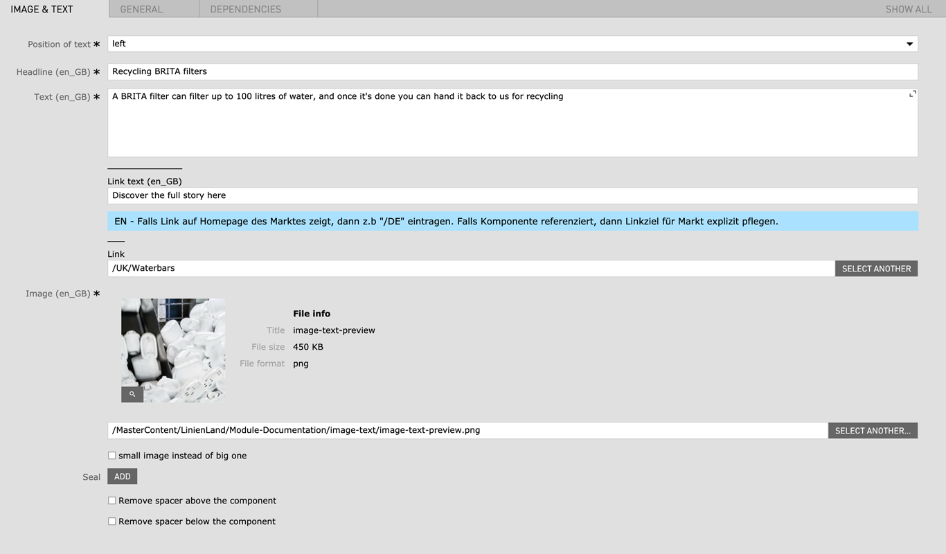
|---|---|---|---|
| Position of text | left / right | - | yes |
| Headline | max. 130 characters | - | yes |
| Text | Max. 600 characters | - | yes |
| Button color | red / green / blue | - | yes |
| Link |
|
- | no |
| Button text | max. 40 characters | - | no |
| Image |
|
- | yes |
| Mobile image |
|
1200px x 750px is the recommended image size but the height specification is flexible. | no |
| White bg | checkbox | - | no |
| Remove spacer below the component (only mobile) | checkbox | - | no |
| Field | Specification | Info | Required |
|---|---|---|---|
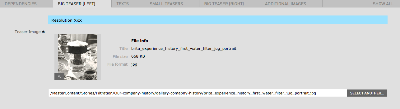
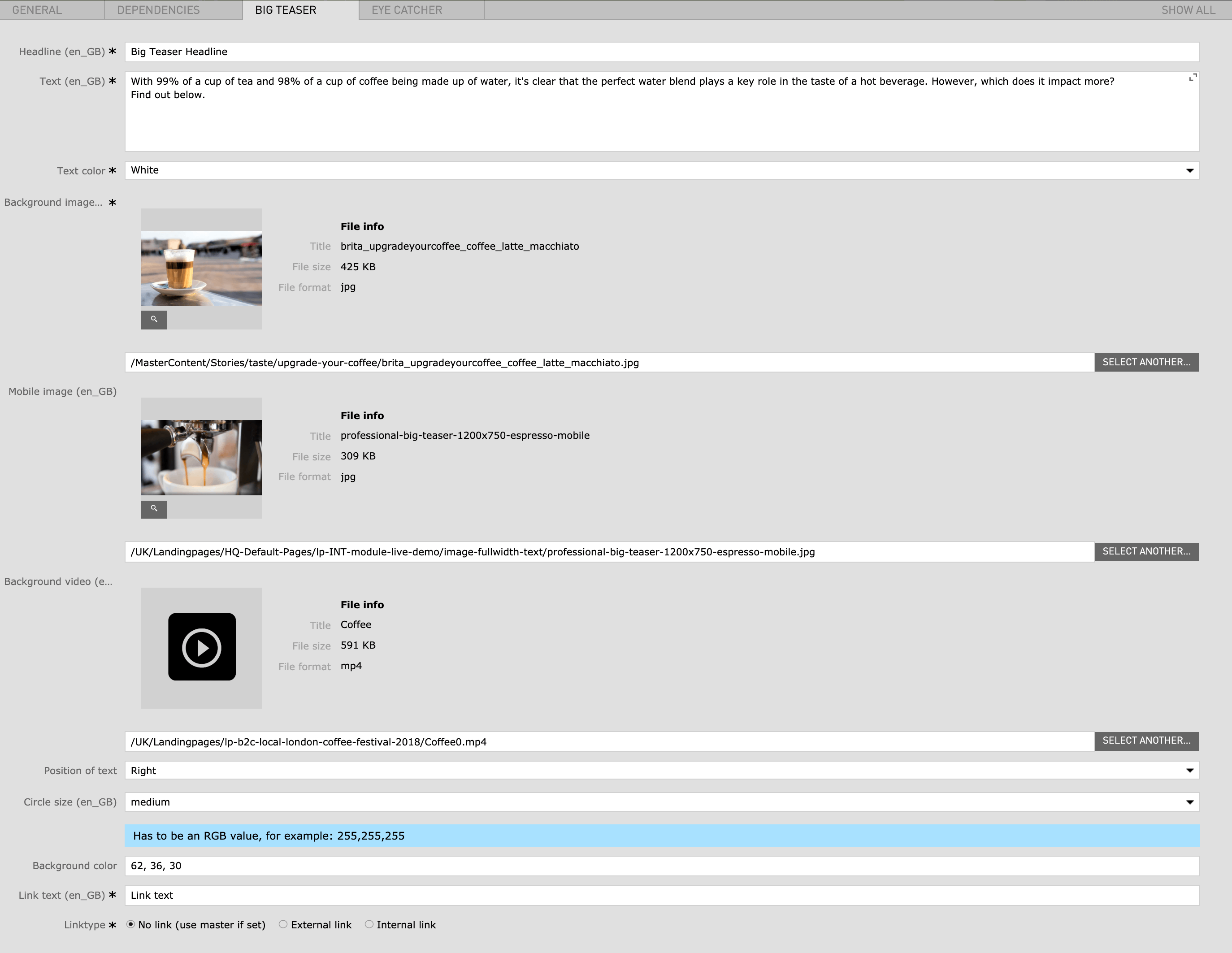
| Big Teaser Left | |||
| Image | 1480px x 1752px / Fileformat JPG, PNG | - | yes |
| Texts | |||
| Headline | Max. 120 characters | - | yes |
| Text | - | - | yes |
| Small Teasers | |||
| Image | 1496px x 840px / Fileformat JPG, PNG | - | yes |
| Youtube Video | - |
Look at the URL of the Youtube Video, and at the end of it, you should see a combination of numbers and letters after an equal sign (=). This is the code you need to enter into your YouTube ID Field. Example https://www.youtube.com/watch?v=v26U16_gliE |
no |
| Big Teaser Right | |||
| Image | 1480px x 1752px / Fileformat JPG, PNG | - | yes |
| Mobile Image | 1496px x 840px / Fileformat JPG, PNG | - | yes |
| Additional Images | |||
| Teaser Image | 1480px x 1752px / Fileformat JPG, PNG | - | yes |
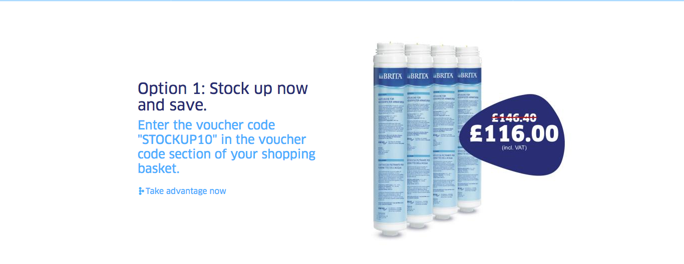
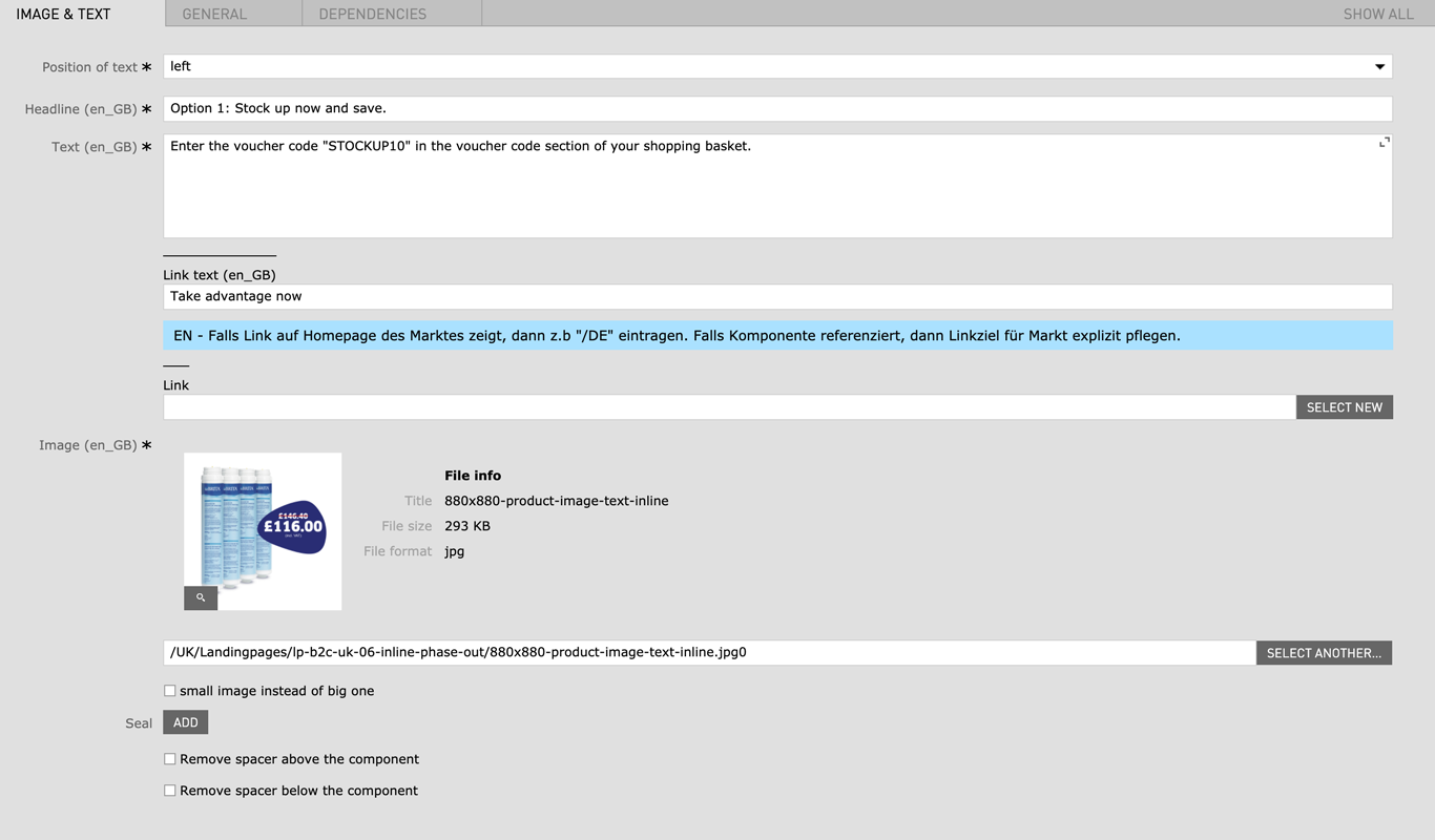
| Field | Specification | Info | Required |
|---|---|---|---|
| Position of text | left / right | - | yes |
| Headline | max. 60 characters | For SEO Purposes it is recommended to use a long tail keyword within the heading. | yes |
| Text | Max. 250 characters | - | yes |
| Image | 880px x 880px / JPG, PNG | - | yes |
| Small image instead of big one | - | - | no |
| Seal | JPG, PNG | - | no |
| Remove spacer above the component | checkbox | Removes the top margin of the module If the Image RichText Module is used within the Image Text Slider Area remove spacer will not work |
no |
| Remove spacer below the component | checkbox | Removes the bottom margin of the module If the Image RichText Module is used within the Image Text Slider Area remove spacer will not work |
no |
| Field | Specification | Info | Required |
|---|---|---|---|
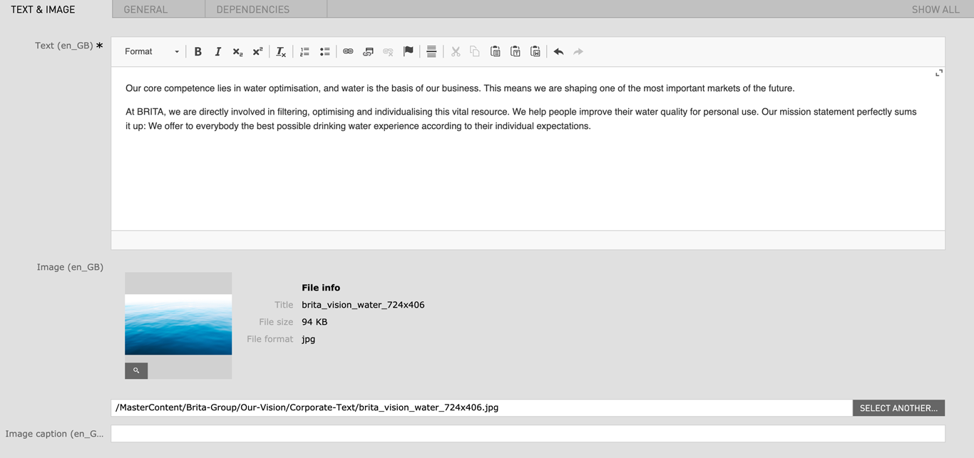
| Text | Max. 600 characters | - | yes |
| Image | 480px x 270px / JPG, PNG | - | no |
| Image caption | Max. 60 characters | - | no |
| Remove spacer above the component | checkbox | Removes the top margin of the module | no |
| Remove spacer below the component | checkbox | Removes the bottom margin of the module | no |
| Field | Specification | Info | Required |
|---|---|---|---|
| Headline | max. 120 characters | For SEO Purposes it is recommended to use a long tail keyword within the heading. | no |
| Subheadline | - | - | no |
| Image (Width) |
|
For best quality, the given minimum width are recommended for the images. The image height is flexible. | yes |
| Mobile Image (Width) |
|
For best quality, the given minimum width are recommended for the images. The image height is flexible. | yes |
| Image width (Desktop) |
|
This setting corresponds with the image width in the desktop view. the mobile and tablet image width will adapt accordingly to the selected desktop width. | yes |
| Position of image |
|
- | yes |
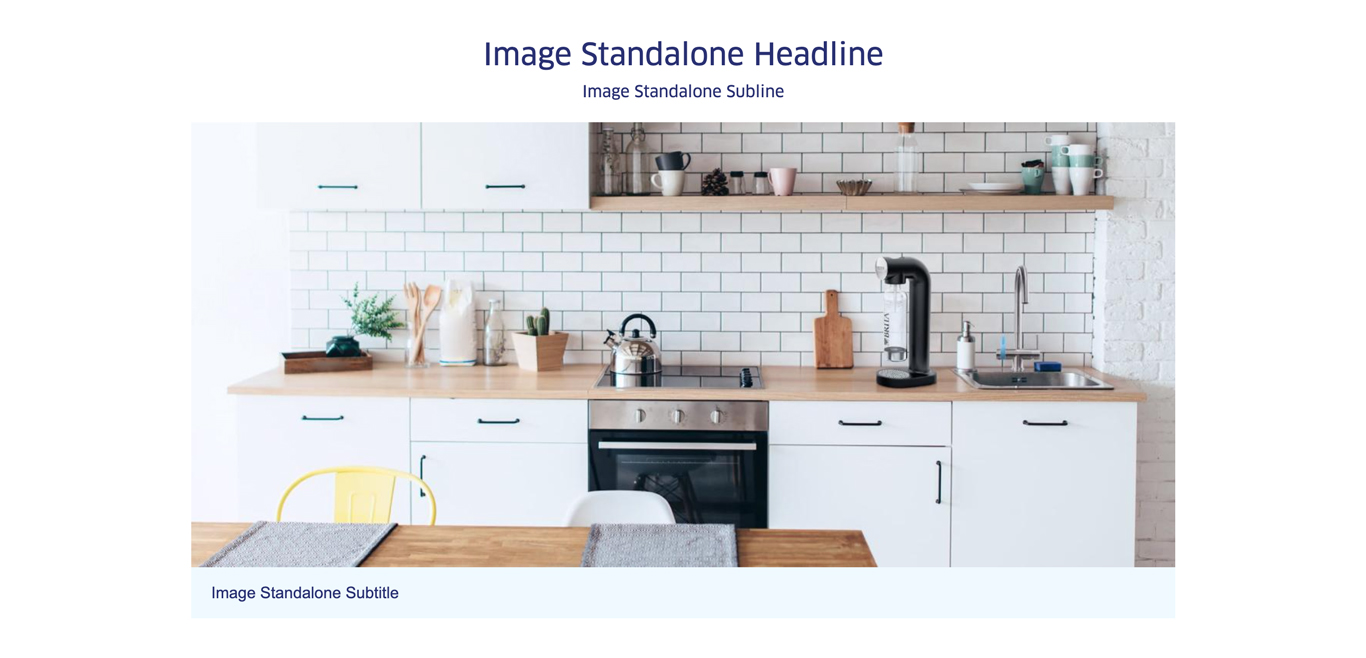
| Image subtitle | - | - | no |
| Position image subtitle |
|
- | yes |
| Remove spacer above the component | checkbox | Removes the top margin of the module | no |
| Remove spacer below the component | checkbox | Removes the bottom margin of the module | no |
| Field | Specification | Info | Required |
|---|---|---|---|
| Position of text |
|
- | yes |
| Headline | max. 130 characters | - | yes |
| Text | Max. 300 characters | - | yes |
| Image |
|
- | yes |
| small image instead of big one | checkbox | - | no |
| Seal |
|
- | yes |
| Remove spacer above the component | checkbox | Removes the top margin of the module If the Image Text Module is used within the Image Text Slider Area remove spacer will not work |
no |
| Remove spacer below the component | checkbox | Removes the bottom margin of the module If the Image Text Module is used within the Image Text Slider Area remove spacer will not work |
no |
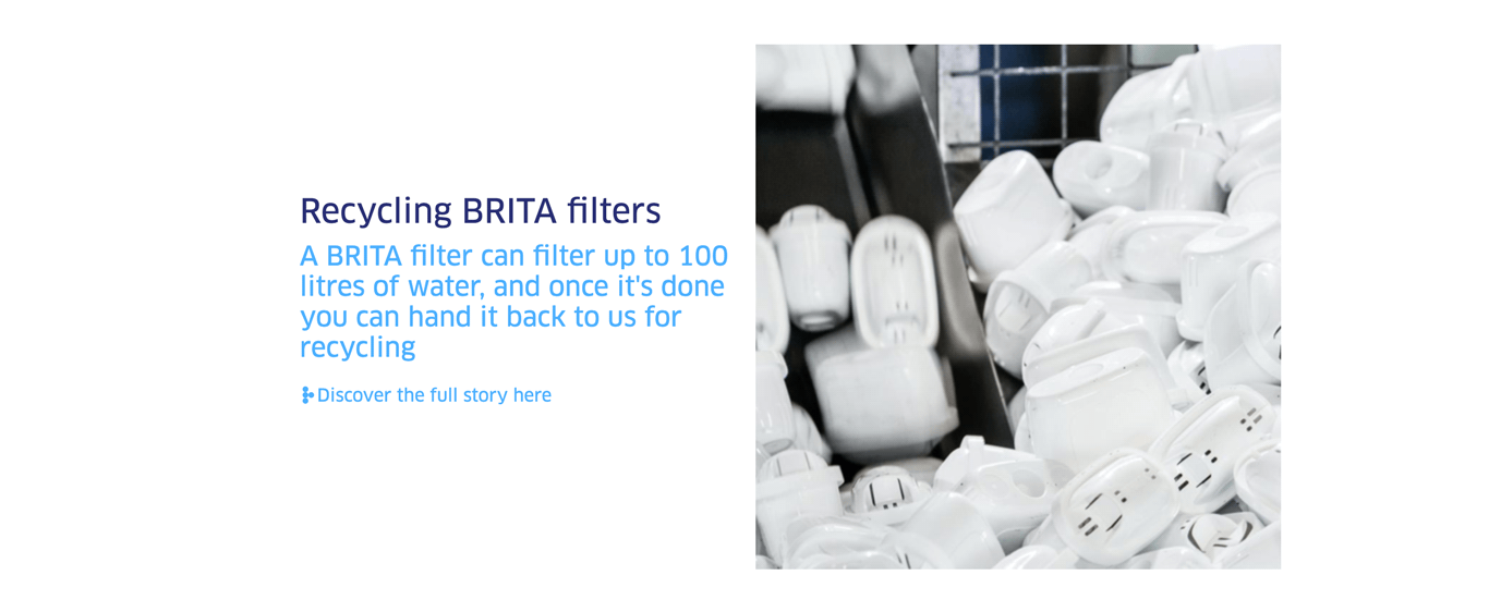
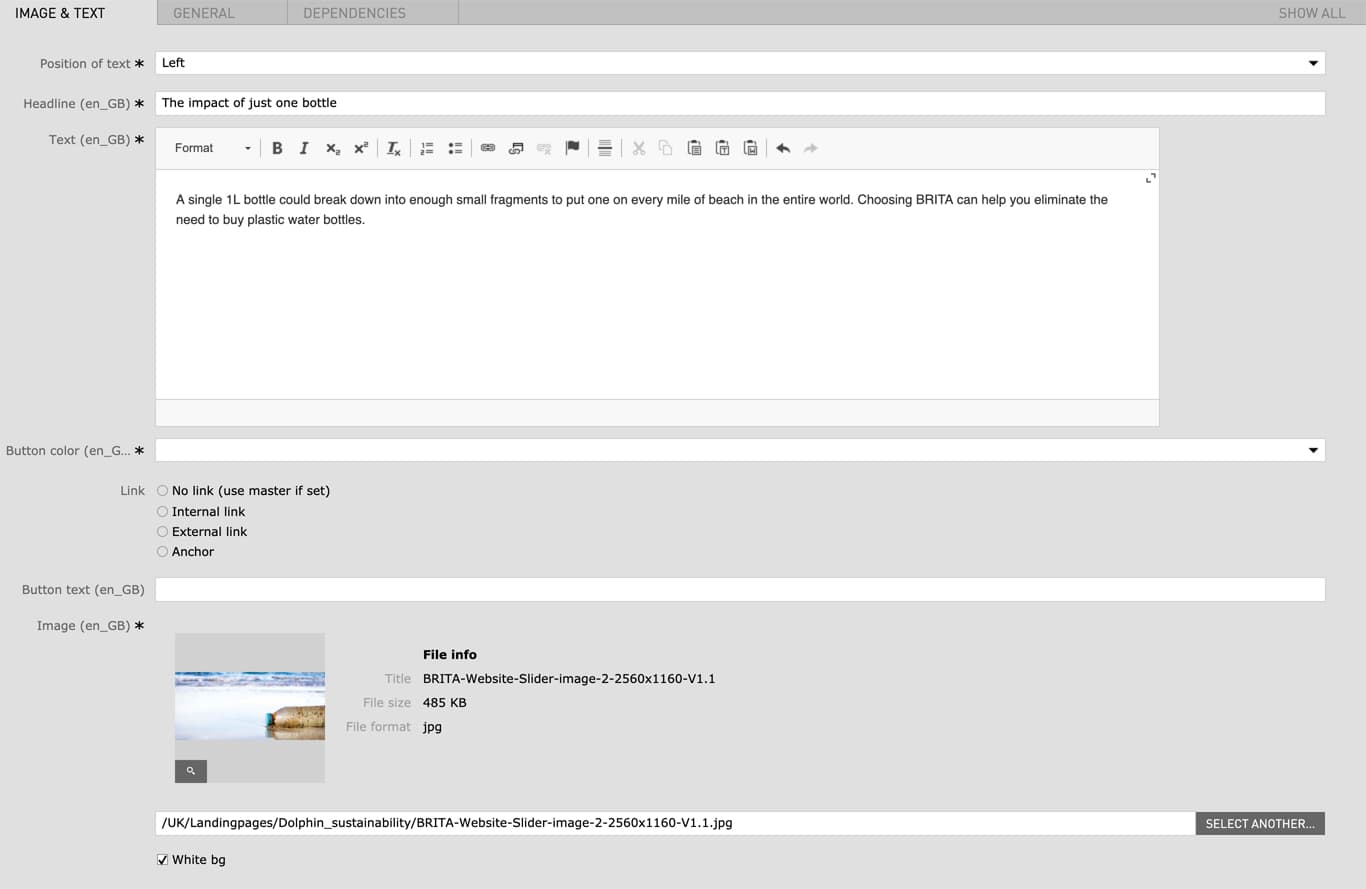
| Field | Specification | Info | Required |
|---|---|---|---|
| Position of text | - | left / right | yes |
| Headline | max. 130 characters | - | yes |
| Text | Max. 600 characters | - | yes |
| Button color | red / green / blue | - | yes |
| Link |
|
- | no |
| Button text | max. 40 characters | - | no |
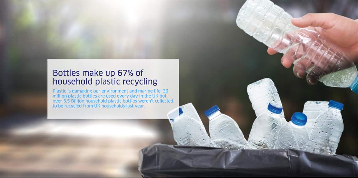
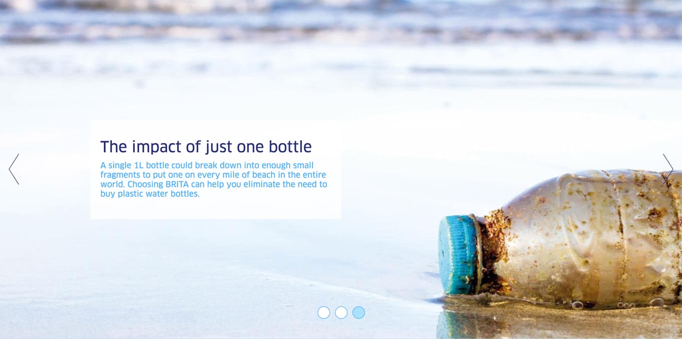
| Image | 2560px x 1160px / Fileformat JPG, PNG | - | yes |
| White bg | checkbox | - | no |
| Field | Specification | Info | Required |
|---|---|---|---|
| Position of text | left / right | - | yes |
| Headline | Max. 30 characters | For SEO Purposes it is recommended to use a long tail keyword within the heading. | yes |
| Text | max. 130 characters | - | yes |
| Image | 880px x 880px / Fileformat Transparent PNG | - | yes |
| Linktype | Internal Link | - | no |
| Seal | PNG / JPG | - | no |
| Remove spacer above the component | checkbox | Removes the top margin of the module | no |
| Remove spacer below the component | checkbox | Removes the bottom margin of the module | no |
| Field | Specification | Info | Required |
|---|---|---|---|
| Headline | max. 130 characters | For SEO Purposes it is recommended to use a long tail keyword within the heading. | yes |
| Text | max. 300 characters | - | no |
| Image | 880px x 880px / Fileformat Transparent PNG | - | no |
| Field | Specification | Info | Required |
|---|---|---|---|
| Headline | max. 130 characters | For SEO Purposes it is recommended to use a long tail keyword within the heading. | yes |
| Subheadline | max. 300 characters | - | yes |
| Button text | max. 40 characters | - | no |
| Link |
|
- | no |
| Field | Specification | Info | Required |
|---|---|---|---|
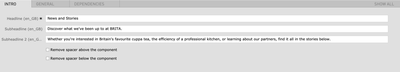
| Headline | max. 130 characters | For SEO Purposes it is recommended to use a long tail keyword within the heading. | yes |
| Subheadline | - | - | no |
| Subheadline 2 | - | - | no |
| Remove spacer above the component | checkbox | Removes the top margin of the module | no |
| Remove spacer below the component | checkbox | Removes the bottom margin of the module | no |
| Field | Specification | Info | Required |
|---|---|---|---|
| Area Headline | |||
| Headline | max. 130 characters | For SEO Purposes it is recommended to use a long tail keyword within the heading. | yes |
| Element 1/2/3 | |||
| Headline | max. 130 characters | For SEO Purposes it is recommended to use a long tail keyword within the heading. | yes |
| Tag | max. 90 characters | - | yes |
| Image Desktop | 480 x 760 / Fileformat JPG | - | yes |
| Image Mobile | 1086 x 390 / Fileformat JPG | - | yes |
| Lightbox Element 1/2/3 | |||
| Headline | max. 130 characters | For SEO Purposes it is recommended to use a long tail keyword within the heading. | yes |
| Text | max. 300 characters | - | yes |
| Image Desktop | 1560 x 792 / Fileformat JPG | - | yes |
| Image Mobile | 1086 x 390 / Fileformat JPG | - | yes |
| Field | Specification | Info | Required |
|---|---|---|---|
| Headline | max. 130 characters | For SEO Purposes it is recommended to use a long tail keyword within the heading. | yes |
| Text | max. 500 characters | - | no |
| Image | ? x ? / Fileformat Transparent PNG | - | yes |
| Field | Specification | Info | Required |
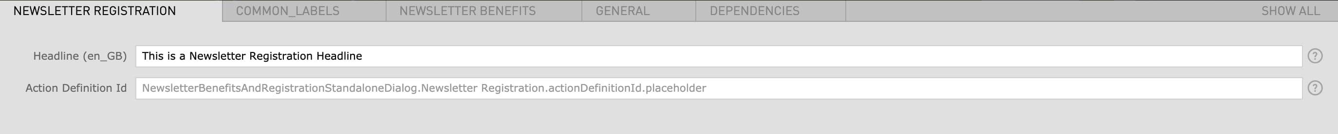
|---|---|---|---|
| Registration | |||
| Headline | max. 130 characters | - | no |
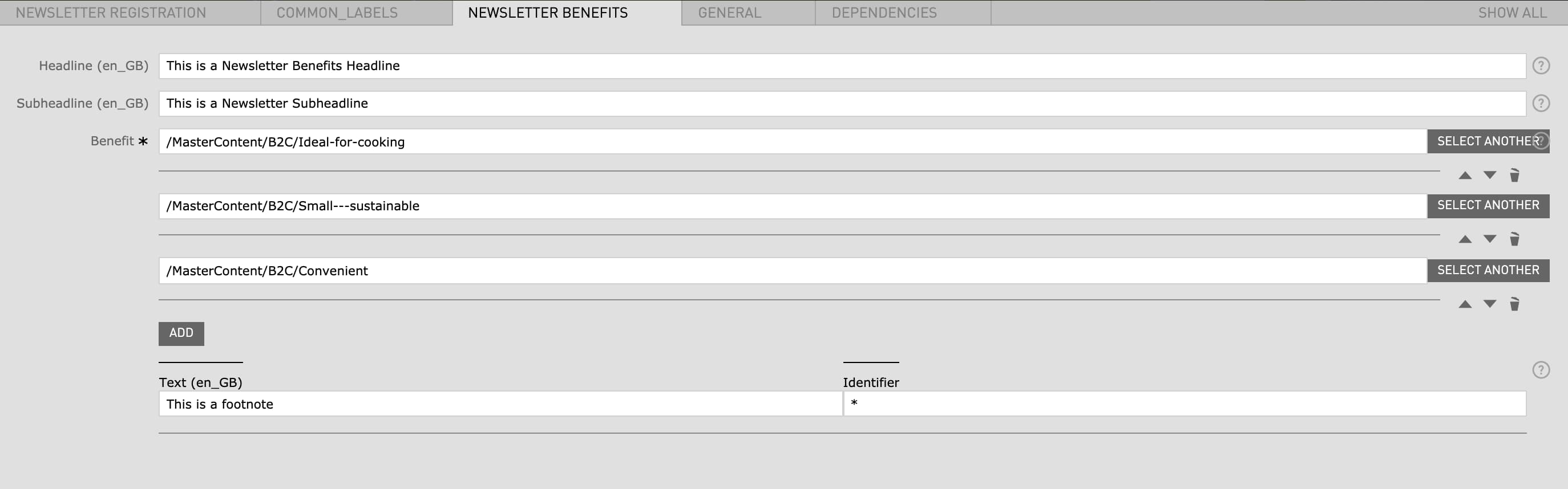
| Benefits | |||
| Headline | max. 130 characters | - | no |
| Subheadline | - | - | no |
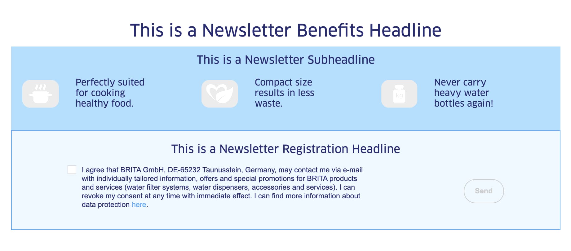
| Benefit | - | has to be created before in the Benefits App (not accessible to all CMS editors) | yes |
| Text (Footnote) | - | - | no |
| Identifier | - | A symbol or number can be used (for example: * or 2) | no |
| Field | Specification | Info | Required |
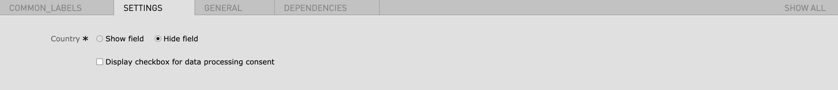
|---|---|---|---|
| Country |
|
- | yes |
| Consent | Display checkbox for data processing consent | This checkbox doesnt need to be checked, the consent checkbox will be automatically added | no |
| Field | Specification | Info | Required |
|---|---|---|---|
| Area | |||
| Headline | Max. 130 characters | For SEO Purposes it is recommended to use a long tail keyword within the heading. | no |
| Subheadline | Max. 130 characters | - | no |
| Big Background Teaser | |||
| Headline | Max. 130 characters | - | yes |
| Image |
|
When the checkbox "full width" is selected the image size for full width needs to be used | yes |
| Mobile image | 710px x 400px | - | no |
| Text |
|
- | no |
| Link |
|
- | no |
| Link text | - | - | no |
| Show as button | checkbox | - | no |
| Button color | red / green / blue | - | yes |
| full width | - | Teaser will span over full width of page | no |
| disable opacity | - | - | no |
| Big Teaser | |||
| Headline | Max. 130 characters | - | yes |
| Image | 488px x 768px / fullwidth 660px x 510px | When the checkbox "full width" is selected the image size for full width needs to be used | yes |
| Light blue background | - | changes the backgroundcolor to light blue, if the image has a background transparency the background will be light blue | no |
| Mobile image | 710px x 400px | - | no |
| Text | Max. 460 without blank spaces / Max. 540 with blank spaces | - | no |
| Link | No link / External Link / Internal Link / Anchor / Download | - | no |
| Link text | - | - | no |
| Add to Cart Button | enabled / disabled | Only relevant for product category pages | no |
| Show as button | - | - | no |
| Button color | red / green / blue | - | yes |
| full width | - | Teaser will span over full width of page | no |
| disable opacity | - | - | no |
| Small Background Teaser | |||
| Headline | Max. 130 characters | - | yes |
| Image | 714px x 1122px | - | yes |
| Mobile image | 714px x 1122px | - | no |
| Text | Max. 100 without blank spaces / Max. 80 with blank spaces | - | no |
| Link | No link / External Link / Internal Link / Anchor / Download | - | no |
| Link text | - | - | no |
| Show as button | - | - | no |
| Button color |
|
- | yes |
| disable opacity | - | - | no |
| Small Teaser | |||
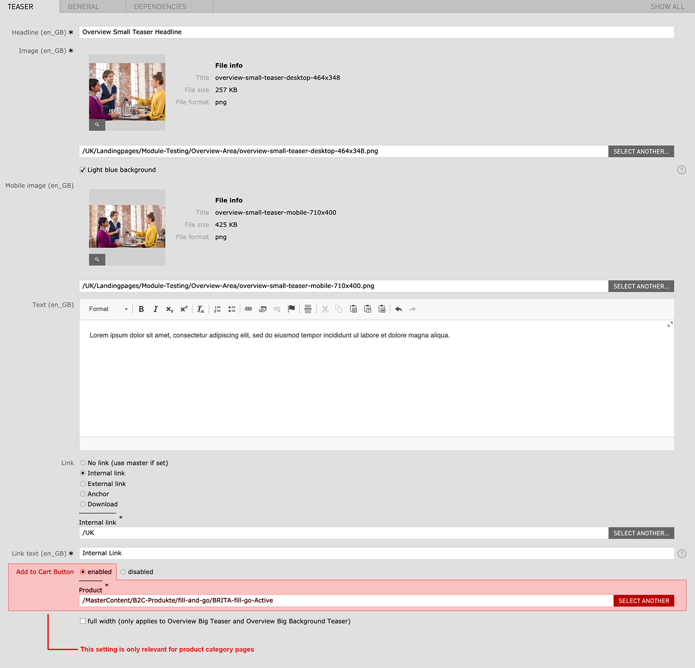
| Headline | Max. 130 characters | - | yes |
| Image | 464px x 348px | - | yes |
| Light blue background | - | changes the backgroundcolor to light blue, if the image has a background transparency the background will be light blue | no |
| Mobile image | 710px x 400px | - | no |
| Text | Max. 185 without blank spaces / Max. 220 with blank spaces | - | no |
| Link | No link / External Link / Internal Link / Anchor / Download | - | no |
| Link text | - | - | no |
| Add to Cart Button | enabled / disabled | Only relevant for product category pages | no |
| Show as button | - | - | no |
| Button color |
|
- | yes |
| disable opacity | - | - | no |
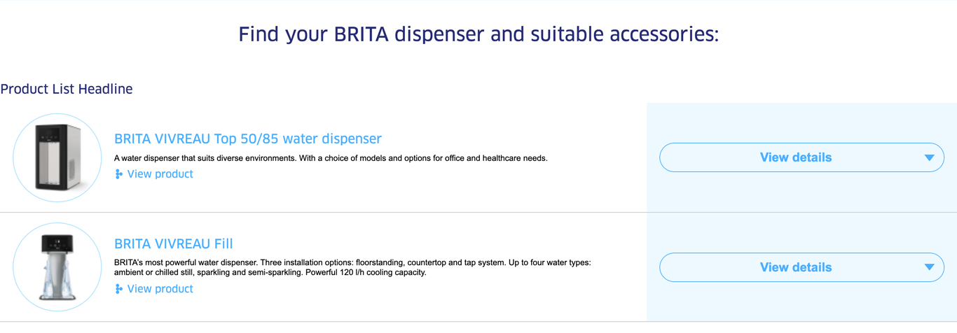
| Field | Specification | Info | Required |
|---|---|---|---|
| Headline | max. 130 characters | For SEO Purposes it is recommended to use a long tail keyword within the heading. | no |
| Category |
|
- | yes |
| Contact Anchor | - | Anchor link to contact form | no |
| Product | - |
|
yes |
| Image Headline type |
|
- | yes |
| Rendering |
|
- | no |
| Extra text above button | - | The text is shown above the contact button. You can only reference a so-called “Common Label” | no |
| Contact button | checkbox | hides the contact button | no |
| Buy button | checkbox | hides the buy button | no |
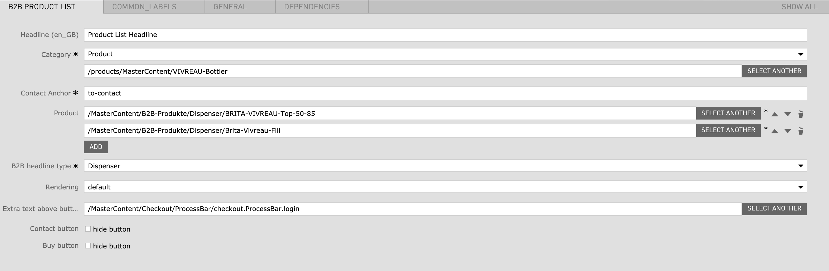
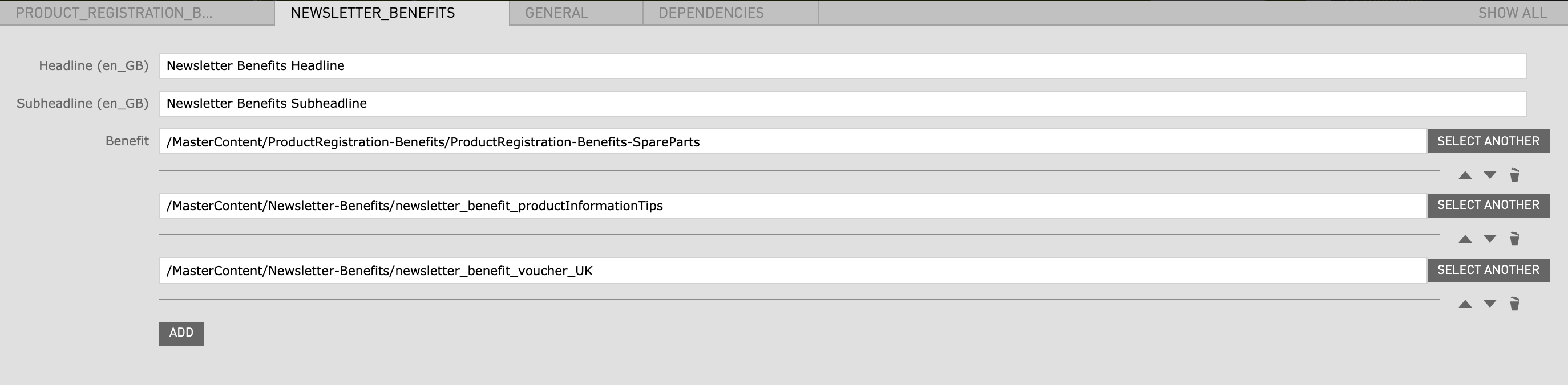
| Field | Specification | Info | Required |
|---|---|---|---|
| Product Registration Benefits | |||
| Headline | max. 130 characters | - | yes |
| Subheadline | - | - | no |
| Benefit | - | has to be created before in the Benefits App (not accessible to all CMS editors) | yes |
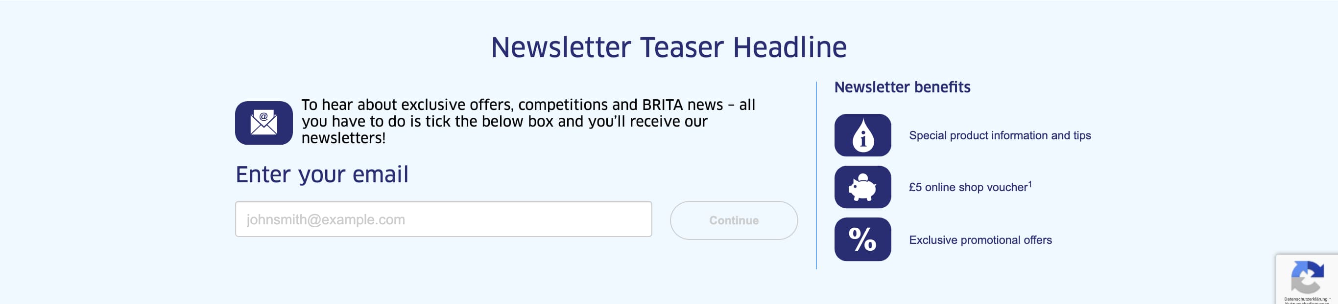
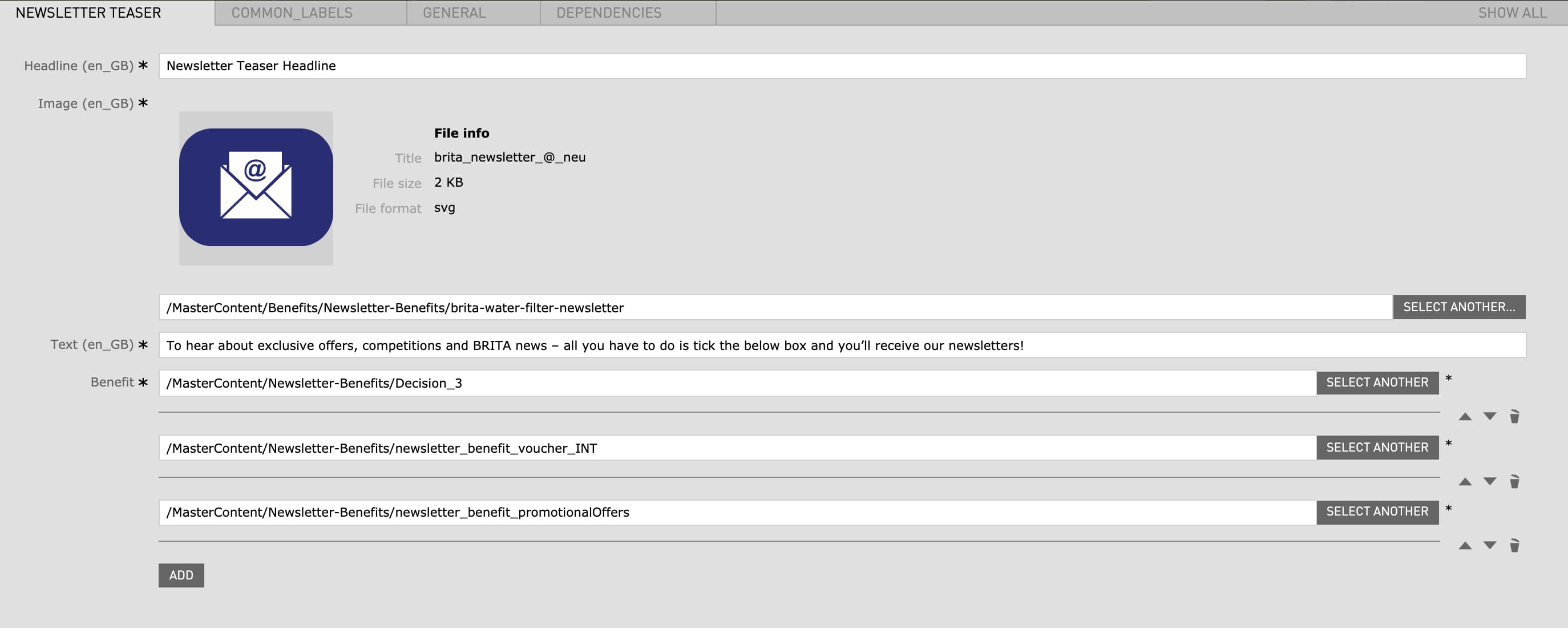
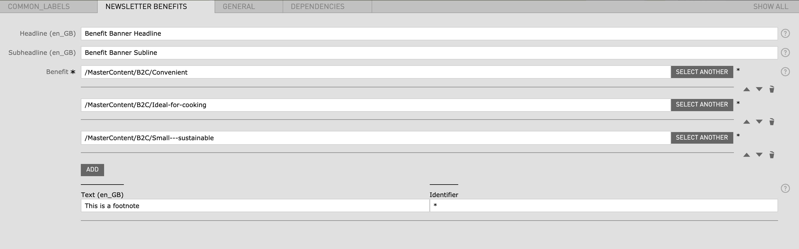
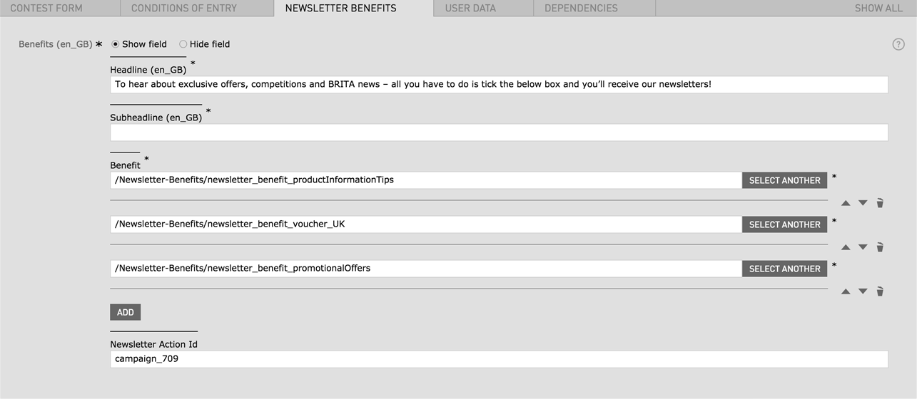
| Newsletter Benefits | |||
| Headline | max. 130 characters | - | no |
| Subheadline | - | - | no |
| Benefit | - | has to be created before in the Benefits App (not accessible to all CMS editors) | no |
| Field | Specification | Info | Required |
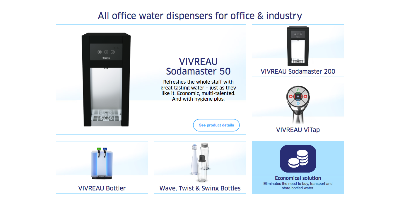
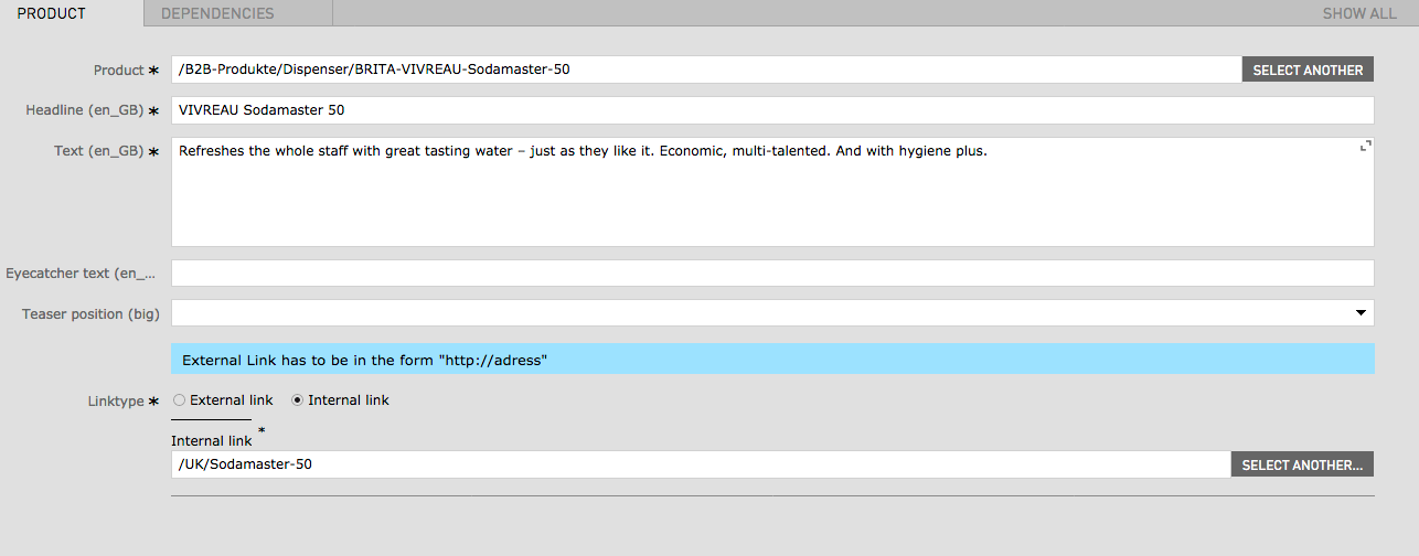
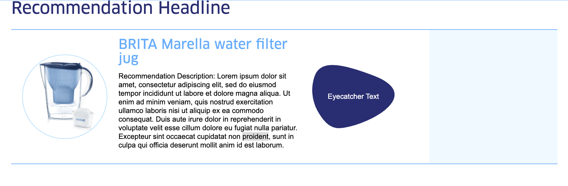
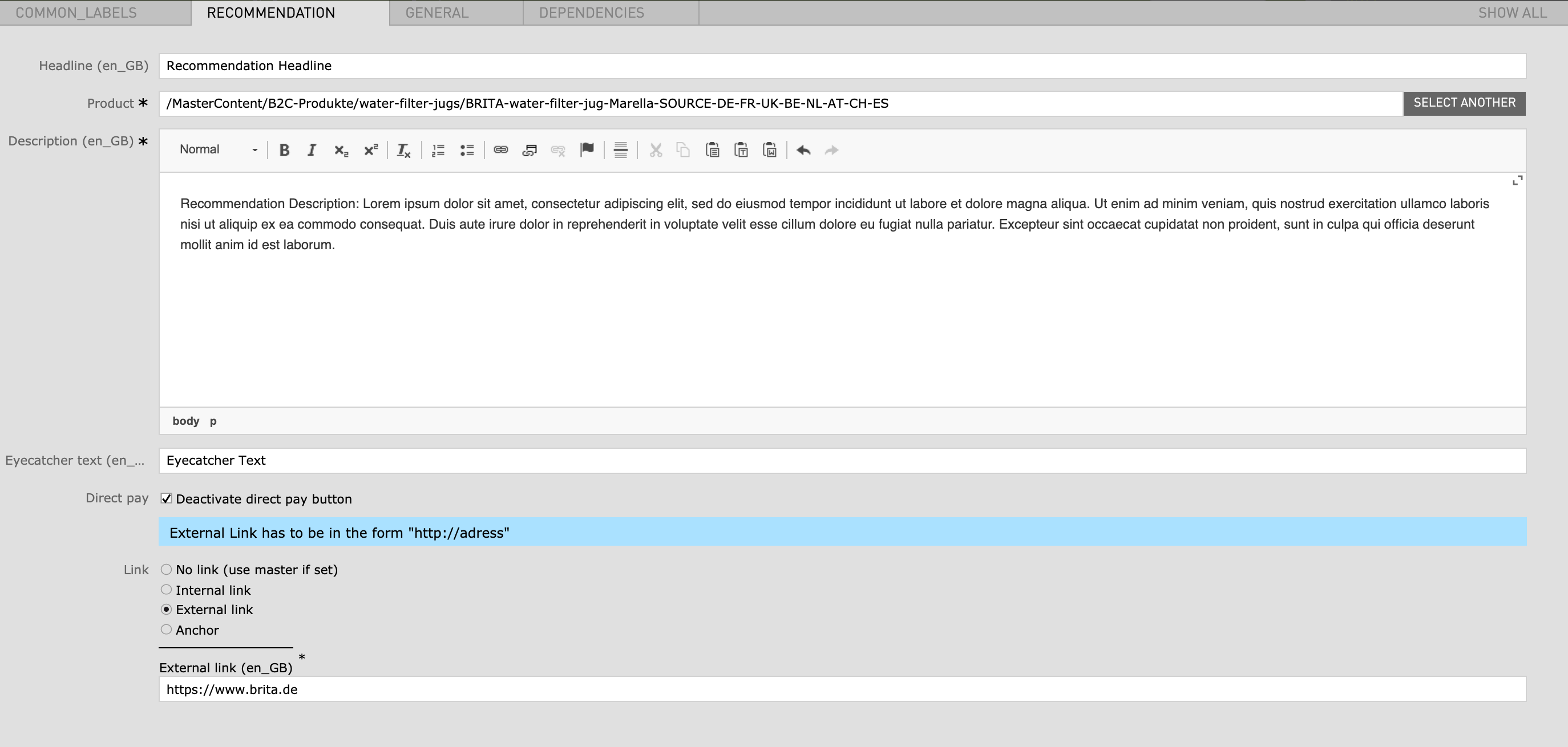
|---|---|---|---|
| Headline | - | - | no |
| Product | - | a Product from the master content has to be linked here | yes |
| Description | - | - | yes |
| Eyecatcher text | max. 130 characters | - | no |
| Direct pay | checkbox | Deactivate direct pay button | no |
| Link |
|
- | no |
| Field | Specification | Info | Required |
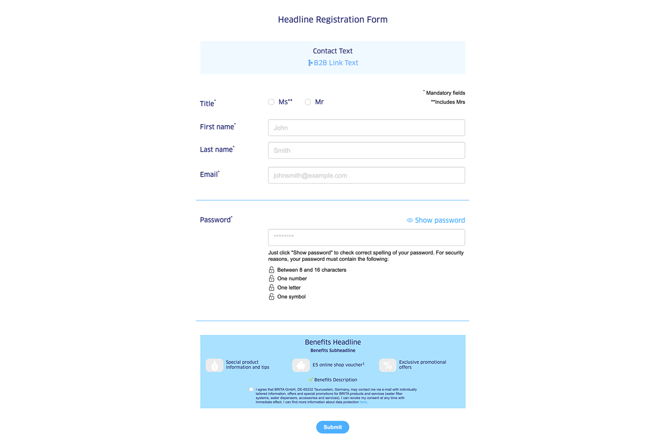
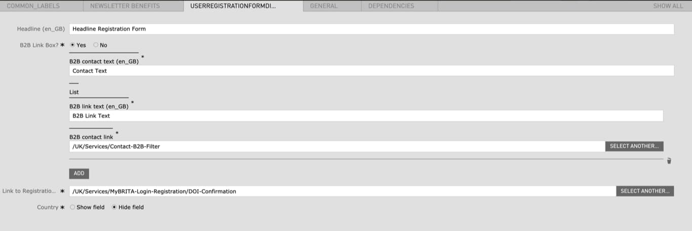
|---|---|---|---|
| User Registration Form | |||
| Headline | - | - | no |
| Image Link Box |
|
- | yes |
| Link to Registration Confirmation Page |
|
- | yes |
| Country |
|
- | yes |
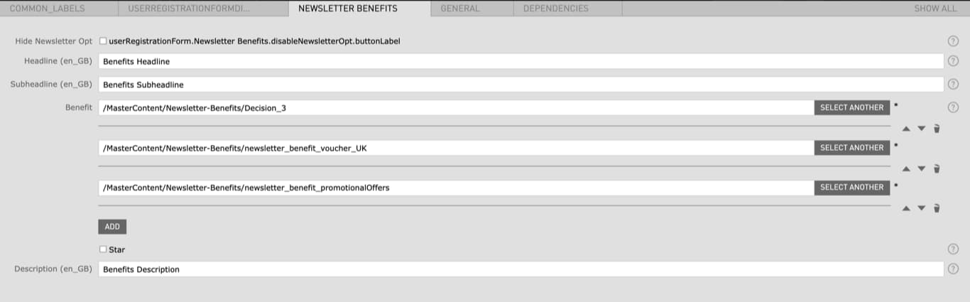
| Newsletter Benefits | |||
| Hide Newsletter Opt |
|
If checked the Benefits will not be displayed | no |
| Headline | - | - | no |
| Subheadline | - | - | no |
| Benefit | - | has to be created before in the Benefits App (not accessible to all CMS editors) | no |
| Star |
|
- | no |
| Description | - | - | no |
| Field | Specification | Info | Required |
|---|---|---|---|
| Headline | Max. 130 characters | For SEO Purposes it is recommended to use a long tail keyword within the heading. | yes |
| Link text | - | - | no |
| Linktype |
|
- | yes |
|
|
- | - | no |
| Link behaviour |
|
- | no |
|
|
- | - | no |
|
|
- | - | no |
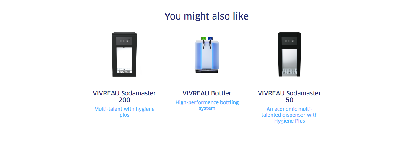
| Field | Specification | Info | Required |
|---|---|---|---|
| Product | - | - | yes |
| Product name | ca. 60 characters | - | yes |
| Description | ca. 130 characters | - | yes |
| Detail page | - | The Product Page you want to link to | yes |
| Field | Specification | Info | Required |
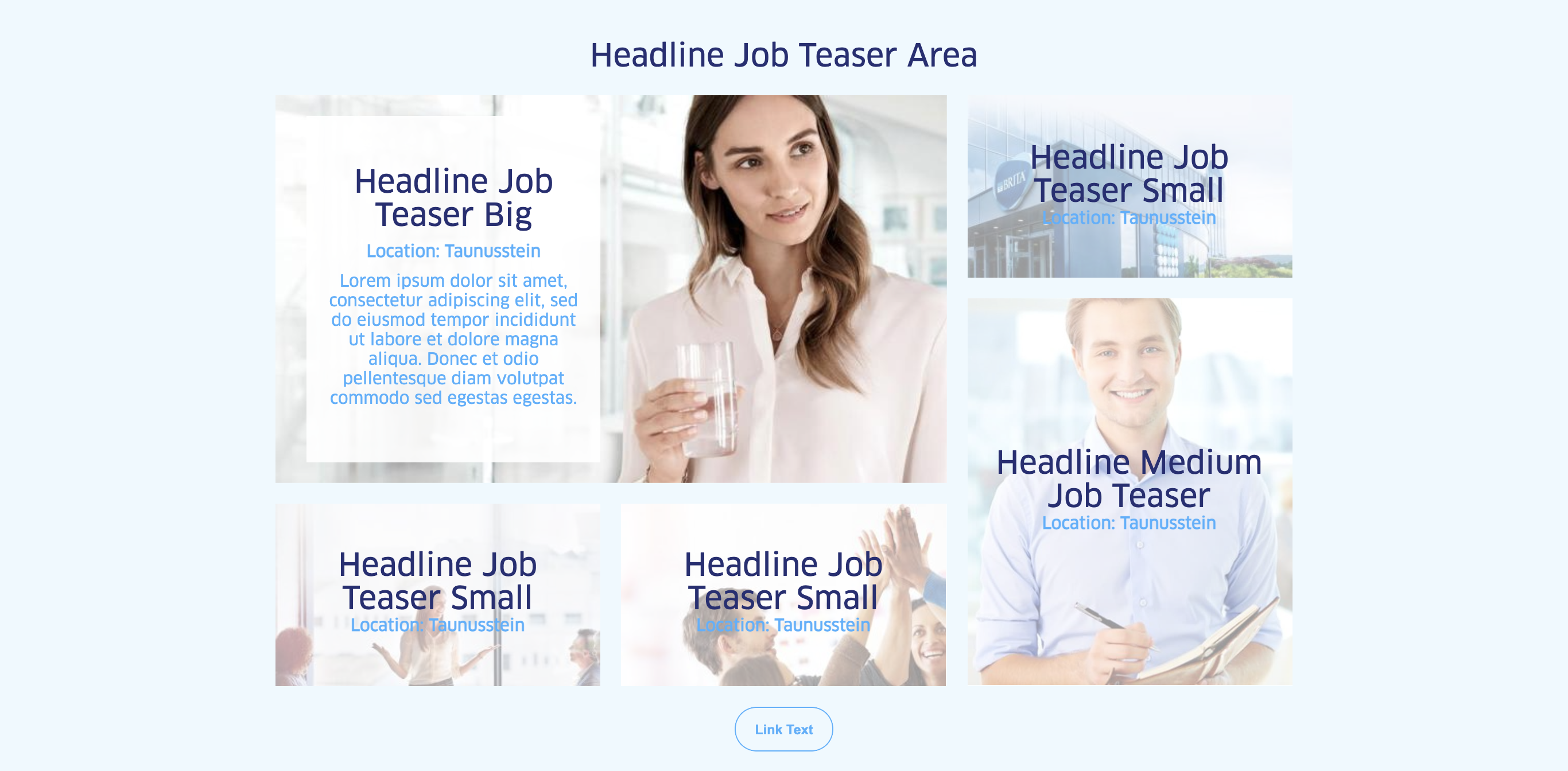
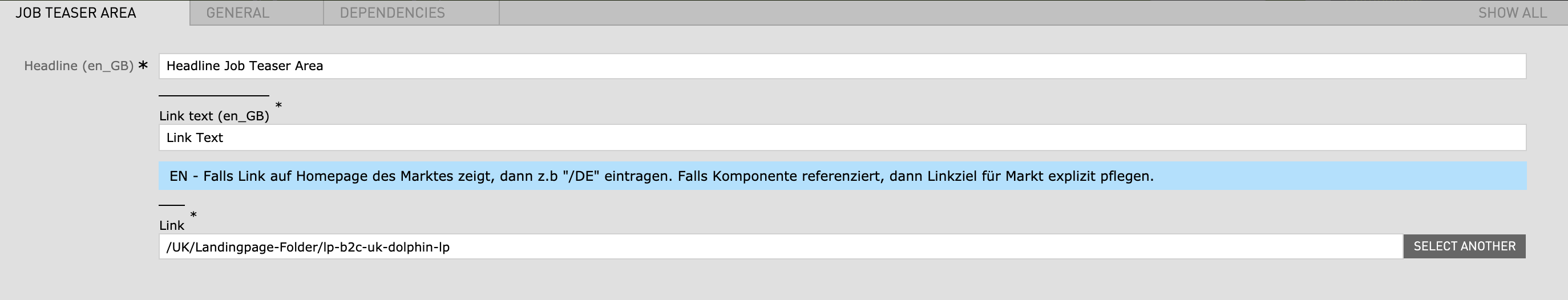
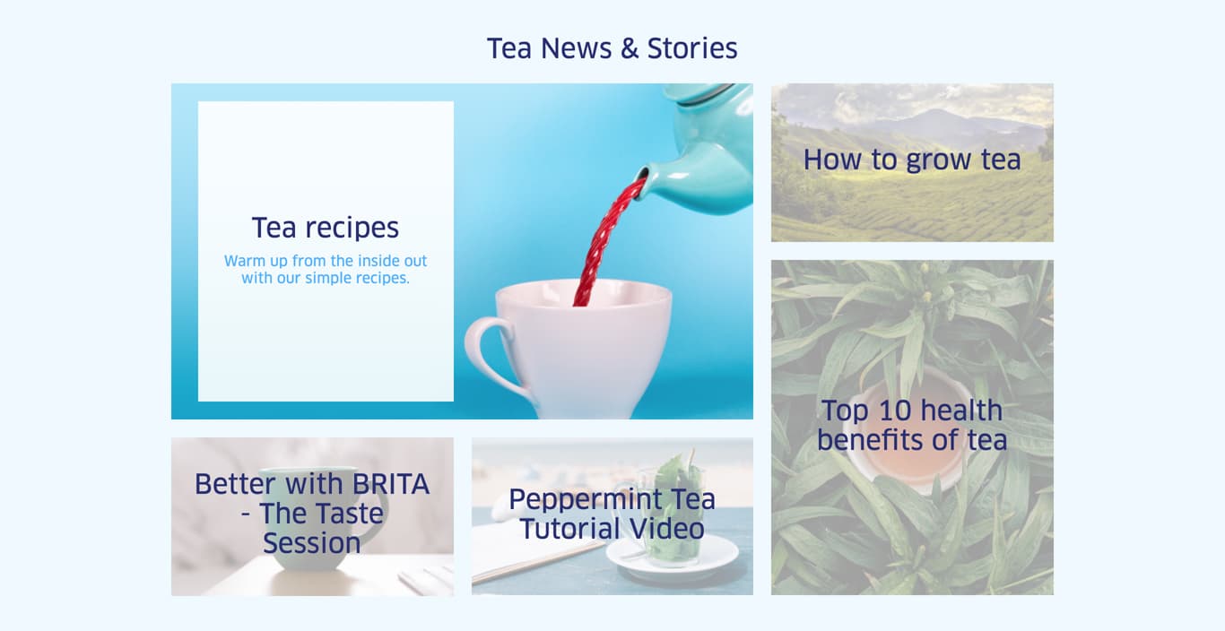
|---|---|---|---|
| Area Headline | |||
| Headline | Max. 130 characters | For SEO Purposes it is recommended to use a long tail keyword within the heading. | no |
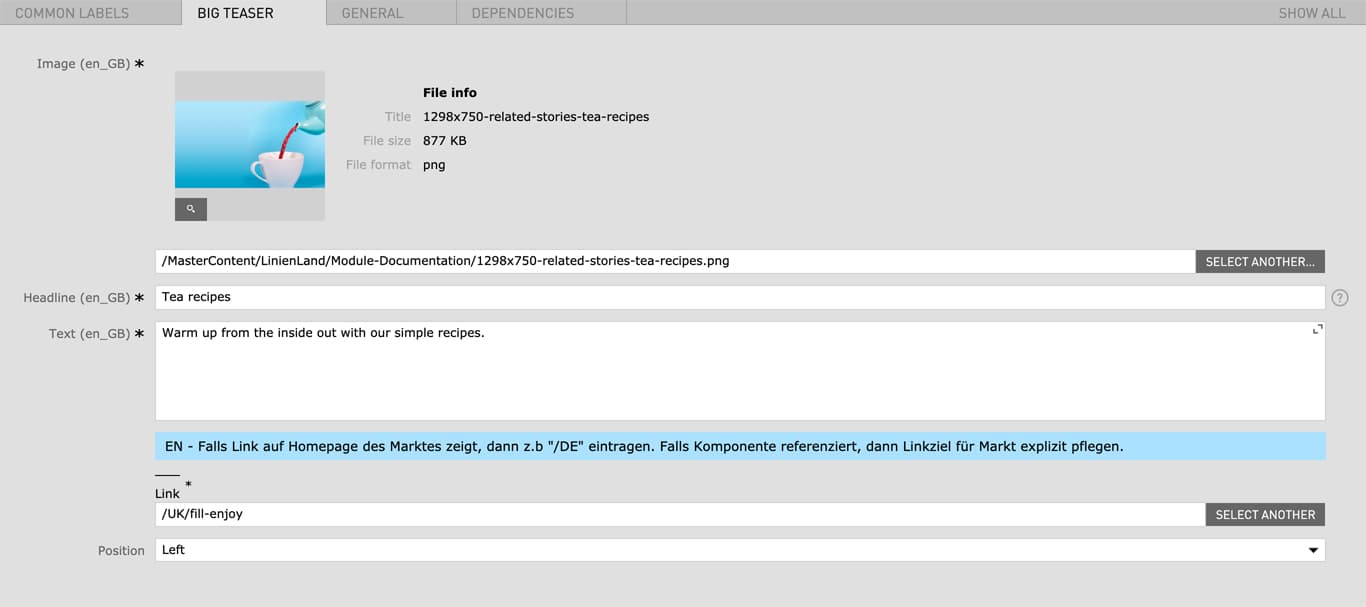
| Big Story Teaser | |||
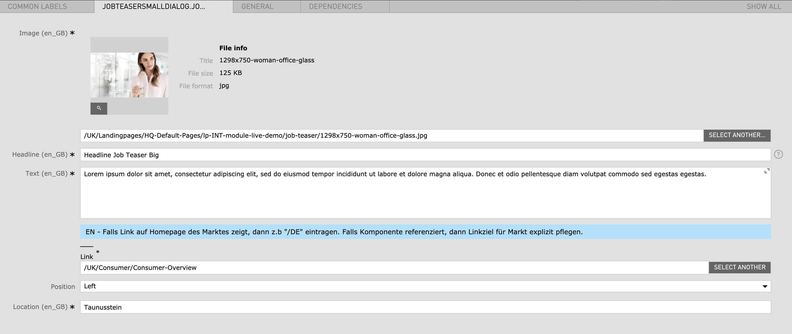
| Image | 1298px x 750px | - | yes |
| Headline | Max. 130 characters | - | yes |
| Text |
|
- | no |
| Link text | - | - | no |
| Link | Internal Link | - | yes |
| Position |
|
- | yes |
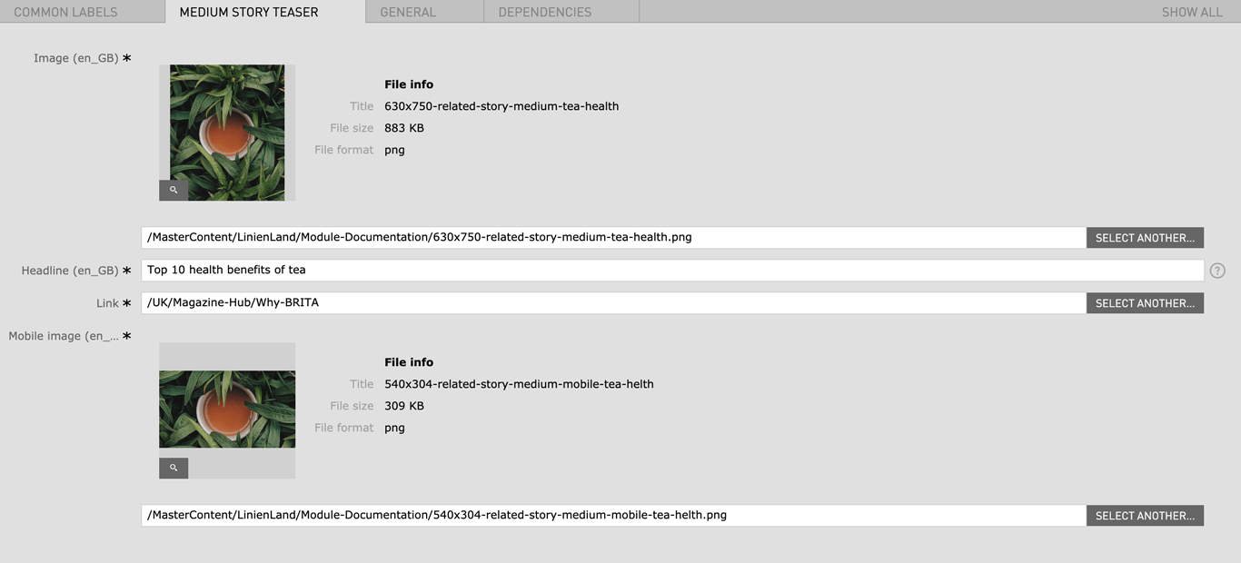
| Medium Story Teaser | |||
| Image | 630px x 750px | - | yes |
| Headline | Max. 130 characters | - | yes |
| Link | Internal Link | - | yes |
| Mobile image | 540px x 304px | - | yes |
| Text |
|
- | no |
| Link text | - | - | no |
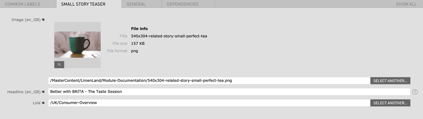
| Small Story Teaser | |||
| Image | 540px x 304px | - | yes |
| Headline | Max. 130 characters | - | yes |
| Link | Internal Link | - | yes |
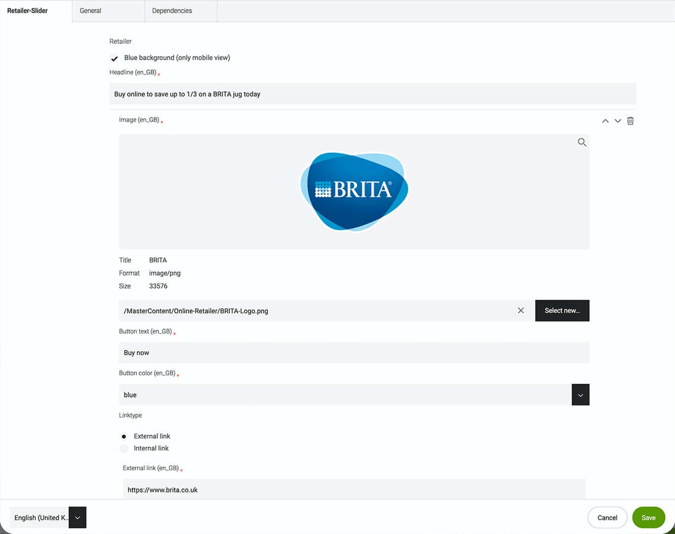
(with "Blue background" active)
| Field | Specification | Info | Required |
|---|---|---|---|
| Blue background (only mobile view) | checkbox | - | |
| Headline | max. 130 characters | - | yes |
| Image | 394px x 296px | - | yes |
| Button text | max. 25 characters | - | yes |
| Button color | - | - | yes |
| Linktype | - | - | yes |
| Field | Specification | Info | Required |
|---|---|---|---|
| Headline | max. 130 characters | For SEO Purposes it is recommended to use a long tail keyword within the heading. | no |
| Text | max. 500 characters | - | yes |
| Remove spacer above the component | checkbox | Removes the top margin of the module | no |
| Remove spacer below the component | checkbox | Removes the bottom margin of the module | no |
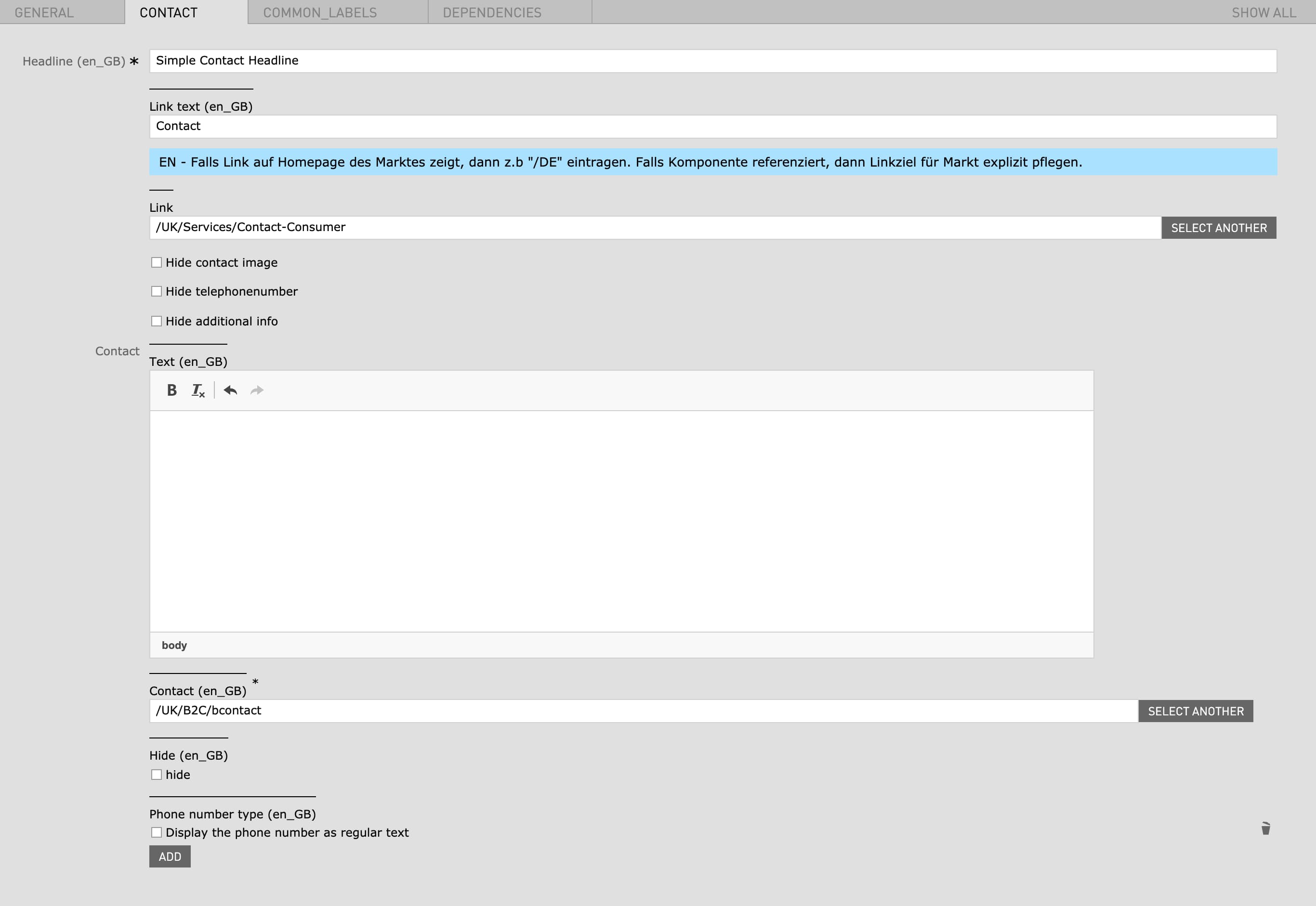
| Field | Specification | Info | Required |
|---|---|---|---|
| Headline | Max. 130 characters | - | yes |
| Link text | - | At the moment "Link text" can not be used | no |
| Link | - | At the moment "Link" can not be used | no |
| Hide contact image | - | - | no |
| Hide telephonenumber | - | - | no |
| Hide additional info | - | - | no |
| Text | - | - | no |
| Contact | - | When a Contact is selected a Contact number is displayed on the left side | no |
| Hide | - | - | no |
| Phone number type | - | Display the phone number as regular text | no |
| Field | Specification | Info | Required |
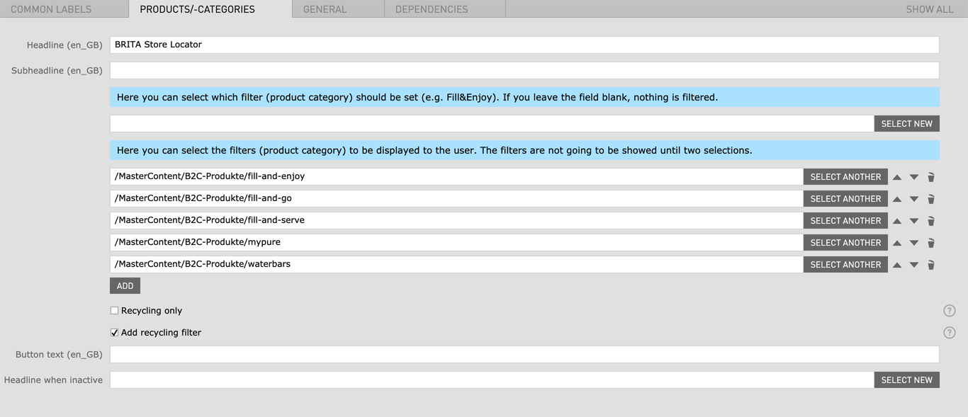
|---|---|---|---|
| Headline | Max. 60 characters | For SEO Purposes it is recommended to use a long tail keyword within the heading. | no |
| Subheadline | max. 130 characters | - | no |
| Product Category | Here you can select the filters (product category) to be displayed to the user. The filters are not going to be showed until two selections. | - | no |
| Recycling only | checkbox | Filters out stores that have no recycling capabilities in the displayed results | no |
| Add recycling filter | checkbox | Add recycling to category filters | no |
| Button text | max. 25 characters | - | no |
| Headline when inactive |
|
- | no |
| Field | Specification | Info | Required |
|---|---|---|---|
| Headline | Max. 60 characters | For SEO Purposes it is recommended to use a long tail keyword within the heading. | yes |
| BG Color | - | Standard Color (Blue) / White | yes |
| Background Image | 2560px x 1160px | - | yes |
| Background video |
|
The video file should be as small as possible to avoid long load times. | no |
| Position of text | left / right | - | yes |
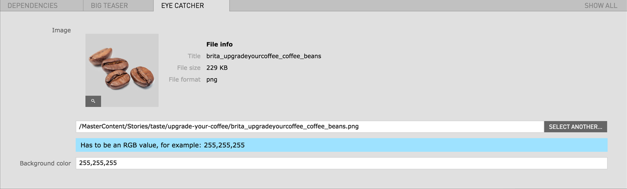
| Eyecatcher image | - | - | no |
| Eyecatcher background | - | - | no |
| Field | Specification | Info | Required |
|---|---|---|---|
| Link text | - | - | yes |
| Link |
|
- | no |
| Field | Specification | Info | Required |
|---|---|---|---|
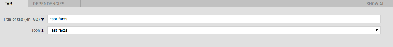
| Title of Tab | - | - | yes |
| Icon | - | - | yes |
| Headline | Max. 60 characters | For SEO Purposes it is recommended to use a long tail keyword within the heading. | yes |
| Text | max. 130 characters | - | no |
| Image | 880px x 880px | - | yes |
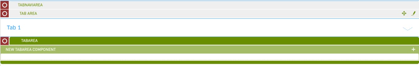
First the Tab Navi Area needs to be created. Afterwards you can add the Tab Navi Title and specify the according Tab Navi Area Module.
| Field | Specification | Info | Required |
|---|---|---|---|
| Title of Tab | - | - | yes |
| The Following Modules can be inserted as Area Modules | |||
| Downloads | More Information | ||
| Image RichText | More Information | ||
| Image Text | More Information | ||
| Product Grid | More Information | ||
| Field | Specification | Info | Required |
|---|---|---|---|
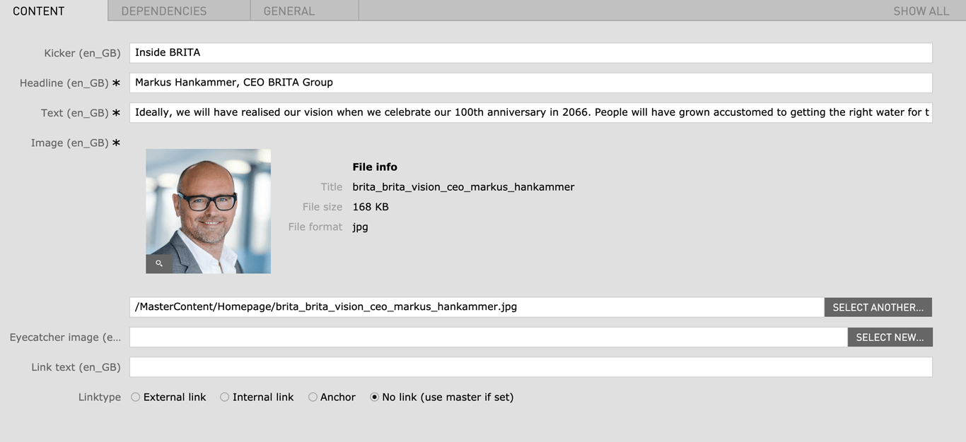
| Kicker | Max. 130 characters | - | no |
| Headline | Max. 130 characters | For SEO Purposes it is recommended to use a long tail keyword within the heading. | yes |
| Text | max. 300 characters | - | yes |
| Image |
|
- | yes |
| Eyecatcher image | - | - | no |
| Link text | - | - | no |
| Linktype |
|
- | no |
| Field | Specification | Info | Required |
|---|---|---|---|
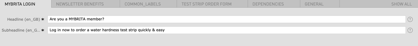
| MYBRITA Login | |||
| Headline | Max. 130 characters | - | yes |
| Subheadline | Max. 130 characters | - | yes |
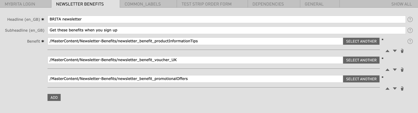
| Newsletter Benefits | |||
| Headline | Max. 130 characters | - | yes |
| Subheadline | Max. 130 characters | - | no |
| Benefit | - | - | yes |
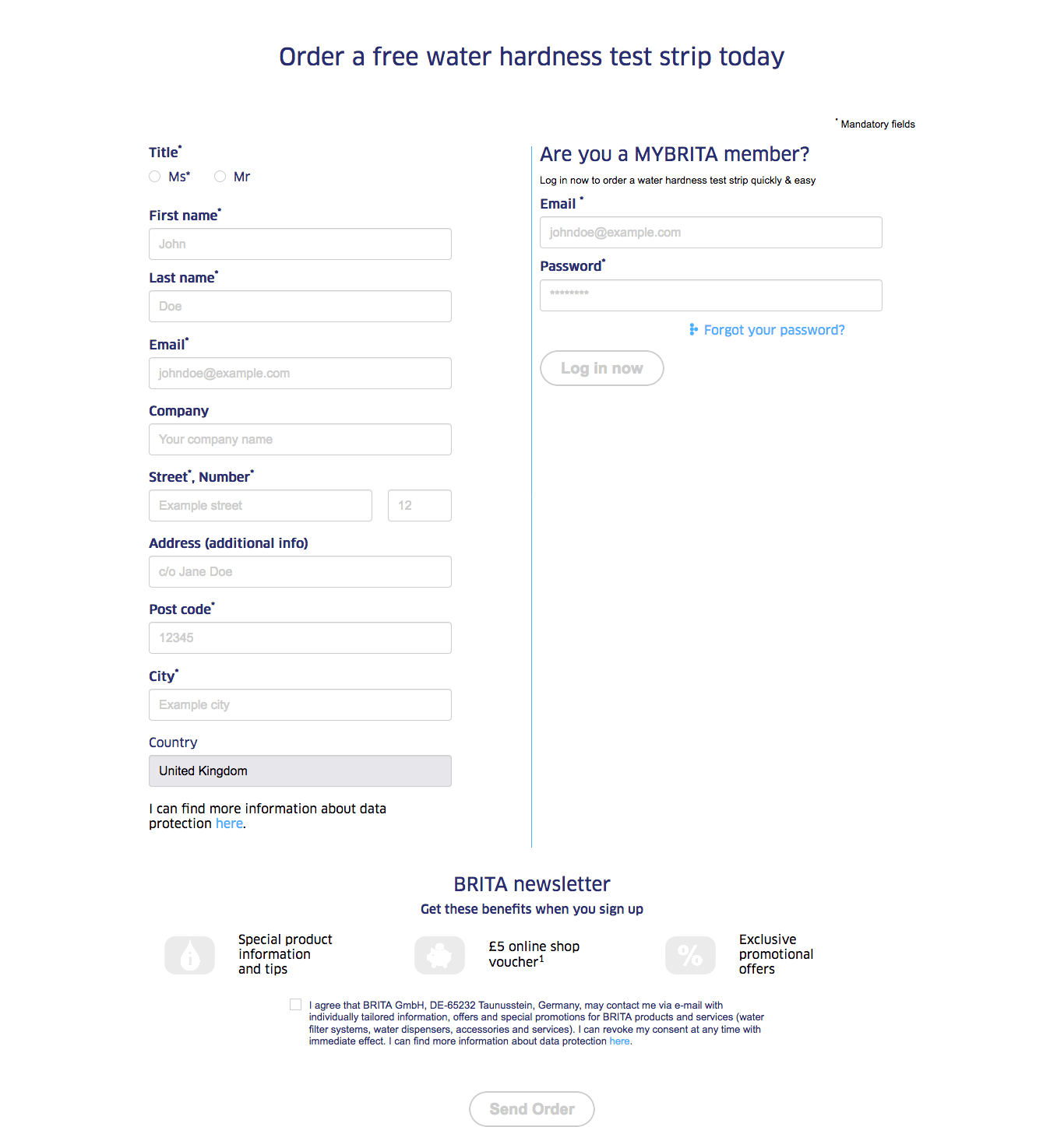
| Test Strip Order Form | |||
| Headline | Max. 130 characters | - | yes |
| Confirmation page | - | - | yes |
| Privacy Protection Text | - | - | yes |
| Field | Specification | Info | Required |
|---|---|---|---|
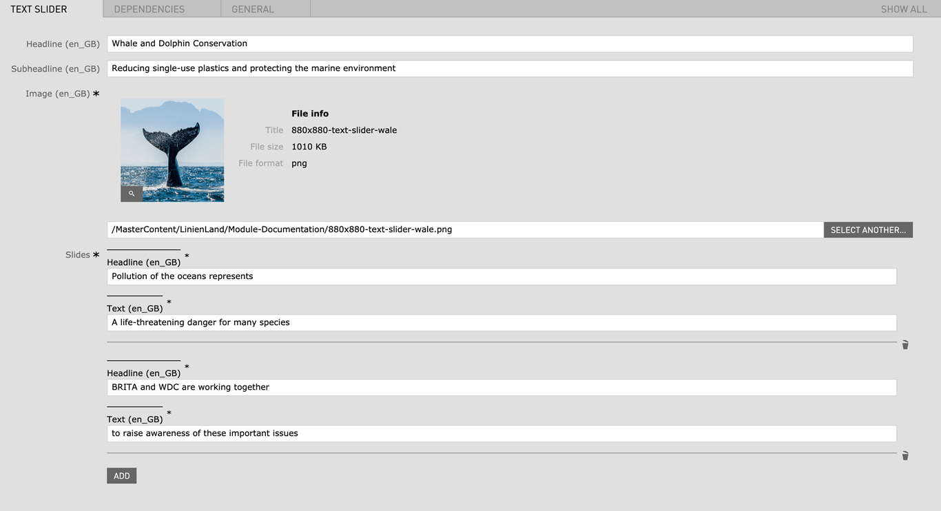
| Headline | Max. 130 characters | - | yes |
| Subheadline | Max. 130 characters | - | yes |
| Image |
|
- | yes |
| Slides | |||
| Headline | Max. 130 characters | - | yes |
| Text | Max. 130 characters | - | yes |
| Field | Specification | Info | Required |
|---|---|---|---|
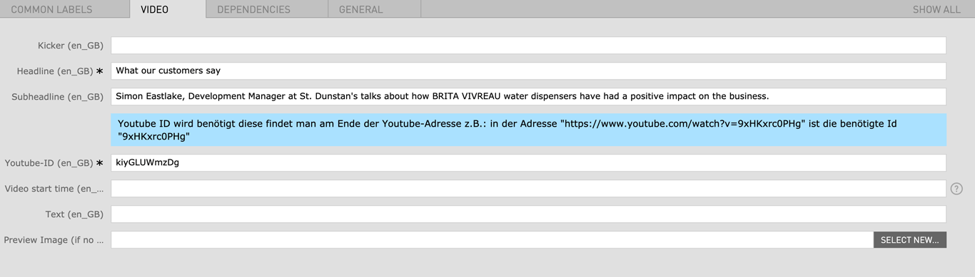
| Kicker | max. 130 characters | - | no |
| Headline | Max. 60 characters | For SEO Purposes it is recommended to use a long tail keyword within the heading. | yes |
| Subheadline | max. 130 characters | - | no |
| Youtube ID | - |
Look at the URL of the Youtube Video, and at the end of it, you should see a combination of numbers and letters after an equal sign (=). This is the code you need to enter into your YouTube ID Field. Example https://www.youtube.com/watch?v=v26U16_gliE |
yes |
| Video start time | - | Set the video start time in the format "Xh Ym Zs", where h stands for hours, m for minutes and s for seconds. For example, 1h 22m 34s, 55m 12s, 34s etc. | no |
| Text | - | - | no |
| Preview Image | 1280px x 720px | In bilingual countries you can select different preview images for each language field | no |


